future's so bright, gotta wear shadesby
SkipComment: Hi Skip! Sorry it didn't fare so well. Here's my analysis, if you want one!
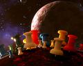
Hits: Composition and color is excellent! It has a very nice feel to it, with the color contrasts, and the contrast against the background. I also like the shadows you captured. The lines and angle of the paper works as well.
Misses: I am not a focus nut, and the focus seems ok, but not real sharp. I can't find anything that looks tack (sorry) sharp, though focus isn't bad. Subject wise, I'm not sure why you used the defective tack, it seems a distraction here. Subject wise: many people don't read titles, and even after reading this, I'm not sure I get the connection. I see someone sees sunglasses in the placement of the tacks--I am, despite my obviously warped imagination, finding it difficult to see them.
Summary: To me, this was a competent shot, which has nice aesthetics. It didn't single itself out at least to me as a strong subject, or as an artsy shot for the wall, and that's why I would have predicted an average score. On the other hand, it looks like it would make an excellent stock photography shot. (If you belong to one of those, you should consider that!)
Hope that analysis helps a little. I think you have a strong portfolio overall, and I wouldn't let one challenge result get to you!