| Image |
Comment |
| 11/18/2004 02:30:15 PM |
Naturalby BudComment: This is a nice portrait. Good lighting and an honest expression. It's well framed. The only thing that isn't perfect is the processing. It looks like compression artifacts and over sharpened. I'm giving it a five, thought I'd give the reason for the score. |
 Photographer found comment helpful. Photographer found comment helpful. |
| 11/17/2004 06:38:03 PM |
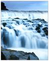
True to natureby terjeComment: It's pretty with the blues but it looks to much as if it's just a regular picture taken for any other challenge. I've seen the smooth water shots a lot. The oversharpened upper left rock is really distracting. Other than that, if it was another challenge, I'd probably give you a high score. |
| Photographer found comment helpful. |
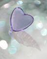
| 11/17/2004 06:24:44 PM |
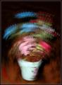
Floral Studyby EddyGComment: Water drops on glass? I hadn't thought of that before. The whites are pleasant without becoming a distraction by being to hard on the eyes. Thanks for entering. Can't wait to read the notes. |
| Photographer found comment helpful. |
| 11/17/2004 06:19:12 PM |
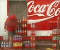
The Deliveryby GolferDDSComment: Photo or ps, it still has a nice feeling to it and I'm a mt dew drinker, too. |
| Photographer found comment helpful. |
| 11/17/2004 06:16:42 PM |
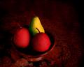
Still LIfe With Pearsby dsidwellComment: The restricted use colors is good as well as the textures. What I find myself doing is looking at whatever it is that the bowl is resting on. It has some great texture to it. This looks almost more from the Renaissance tradition with the precisely outlined fruit and the modeling of the fruit and bowl. |
| Photographer found comment helpful. |
| 11/17/2004 06:08:55 PM |
pines at sunsetby ursulaComment: Looks like a sheet of aluminimum. Good clear colors and an uncomplicated composition. A superb tenchnical study and nice to look at. |
| Photographer found comment helpful. |
| 11/17/2004 06:03:23 PM |
|
| Photographer found comment helpful. |
| 11/17/2004 05:36:18 PM |
|
| Photographer found comment helpful. |
| 11/17/2004 05:34:36 PM |
Radiantby SonifoComment: The colors and background are just lovely. The foreground suffers a little from not enough blurring or not enough sharpness. It's sorta in between and makes me think it would have been better with a lot more focus or a lot less. |
| Photographer found comment helpful. |
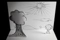
| 11/17/2004 01:38:35 PM |
Sophisticated Travestyby xtabintunComment: If you are going to poke fun at the masses, do it well. The drawings are visual enough to get your point across without having to leave the outside area as a hint to the viewers. Fill the frame and I like thatcloudthere's idea of having the shadows come towards the camera. I'd even think a flashlight beaming out from behind the sun's position would have been fun. A lower camera angle would help to. And think of what you could do to get that heavily manipulated burn/dodge look in the sky.
It's a good statement about how you feel about the voter's choices. Have you considered why you want to participate? |
| Photographer found comment helpful. |
Home -
Challenges -
Community -
League -
Photos -
Cameras -
Lenses -
Learn -
Help -
Terms of Use -
Privacy -
Top ^
DPChallenge, and website content and design, Copyright © 2001-2025 Challenging Technologies, LLC.
All digital photo copyrights belong to the photographers and may not be used without permission.
Current Server Time: 08/27/2025 10:26:17 PM EDT.