| Image |
Comment |
| 06/10/2005 12:14:49 PM |
|
 Photographer found comment helpful. Photographer found comment helpful. |
| 06/10/2005 11:59:57 AM |
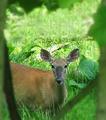
Surprisedby BudComment: This looks artificially blurred. The grass under the branch on the right should be sharper. I'm not against ps enhancements but I do find them more pleasant if done in a less heavy handed manner. |
| Photographer found comment helpful. |
| 06/10/2005 11:28:05 AM |
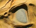
Ancient Grayby EvaanComment: a very beautiful abstract. I hope this isn't to subtle for everyone because I'd like to see it way up there in the scores. |
| Photographer found comment helpful. |
| 06/10/2005 11:23:02 AM |
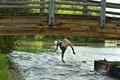
Jump!by sbeaumontComment: It's good to see that some kids can still enjoy the freedom of summer. The one in the water seems to be having a blast.
The composition is weak. The docks on the other side distract and the bridge is cut off at the top. Centered compositions aren't often very exciting. Moving left or right when setting up the picture can sometimes help to isolate the main subject. |
| Photographer found comment helpful. |
| 06/10/2005 11:10:20 AM |
Cloud Puzzleby dahlinComment: One of my favorite things is geometrics and this is a good photo for repetition. This is more of a pattern picture. The only way to think of this as a frame is to consider each one as it's own frame and that becomes to much of a task for this viewer. |
| Photographer found comment helpful. |
| 06/10/2005 10:56:26 AM |
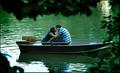
The Kissby pawdrixComment: haha. This makes me feel like a peeping tomasina. I don't like that feeling so I don't think the branches add to the image. personal opinion, sorry. |
| Photographer found comment helpful. |
| 06/10/2005 10:50:33 AM |
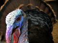
Let's Talk Turkeyby StrikeslipComment: The feathers are the frame. Excellent detail and color on the head. I am missing the cut off part of his beak. |
| Photographer found comment helpful. |
| 06/10/2005 10:32:42 AM |
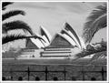
Sunday In Sydneyby megryanComment: I'm not usually a big fan of branches in the foreground because most people don't consider if they add or distract from the composition. And most times they distract, imo. But these really add to your composition because they repeat the shapes in the opera house. Thanks. You've given a completely new way of viewing a much photographed building. |
| Photographer found comment helpful. |
| 06/10/2005 10:06:26 AM |
Lashedby LadeeMComment: The skin is facinating. Almost like there was glitter applied. This fits the challenge. Technically the eye looks cloudy, almost like an older person with cateracts. I do like this for some reason. Maybe it's because of the neutral expression? A square crop would have eliminated any distractions from the eye and created a more forceful statement, imo. |
| Photographer found comment helpful. |
| 06/10/2005 09:54:16 AM |
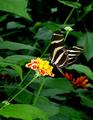
Framed by leavesby AnnaPComment: I like how the red in the wings are repeated in the flower buds. There is a lot of green and one could stretch the meaning of the challenge to say this was a frame but I think you are expecting to much from the viewers. |
| Photographer found comment helpful. |
Home -
Challenges -
Community -
League -
Photos -
Cameras -
Lenses -
Learn -
Help -
Terms of Use -
Privacy -
Top ^
DPChallenge, and website content and design, Copyright © 2001-2025 Challenging Technologies, LLC.
All digital photo copyrights belong to the photographers and may not be used without permission.
Current Server Time: 08/27/2025 02:37:44 AM EDT.