| Image |
Comment |
| 03/26/2004 10:07:01 PM |
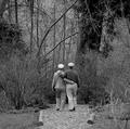
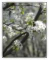
The Golden Years - Springby zeuszenComment: Very nice and apt picture for the title. Excellent range of tones. I love b/w pictures but think this one would have been more pleasing in color because you included spring in the title. If spring isn't green, what is? Anyway, that's just my opinion. |
 Photographer found comment helpful. Photographer found comment helpful. |
| 03/26/2004 09:52:09 PM |
|
| Photographer found comment helpful. |
| 03/26/2004 09:41:46 PM |
Travel and Leisureby lizzyc3Comment: Nice use of thirds. Lots of space for type and stuff. The flip-flop looks accidental and, for me, takes away from the composition. |
| Photographer found comment helpful. |
| 03/26/2004 04:08:19 AM |
American Historyby banmornComment: Good picture that really captures the meaning of the magazine. I think the space at the top was left on purpose, but it seems that everything is scrunched to the bottom and makes it look unbalanced. |
| Photographer found comment helpful. |
| 03/26/2004 04:05:35 AM |
|
| Photographer found comment helpful. |
| 03/26/2004 03:54:56 AM |
Garden Gate - Spring 2004by RHoldenSrComment: Very unique take on the focus. That does separate this from most of the other flower shots. Bold. The colors are a little weak. Did you try adjusting the saturation? |
| Photographer found comment helpful. |
| 03/26/2004 03:43:33 AM |
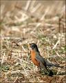
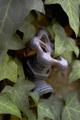
America's Zoos & Preservesby mirdonamyComment: Cute little guy. The framing is good as well as the exposure. The one in the back is a bit distracting because of the brightness. I think it would have been less distracting if it had been darkened up a little. |
| Photographer found comment helpful. |
| 03/26/2004 03:34:16 AM |
Metropolisby flip89Comment: I get a feeling of designed chaos from this picture. All the textures and shapes are great. At first, I didn't like how the post processing flatened out all the details, but as I have looked, I can see how they add to the purely graphic presentation. I think a stark contrast would make this more graphic. |
| Photographer found comment helpful. |
| 03/25/2004 06:04:21 PM |
Southern Gardenerby mcmurmaComment: This has a warm feeling to it. It's almost as if the faucet had a personality and was shyly hiding behind the leaves. I think it might be even better with a bit more of the faucet in focus, but I certainly think it one of the best I've voted on so far just the way it is. |
| Photographer found comment helpful. |
| 03/25/2004 05:48:24 PM |
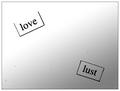
Poetry Magazineby BobsterLobsterComment: I don't know, but this seems to be typed words on some paper. If they are those little magnets, there isn't a way for me to tell because the lighting is so flat. The spots all over could have been cloned out for the challenge, unless you are making some statement about how love is dirty business. Sorry to sound so negative. A major headache with digital photos is all the dust on the sensor. OK, maybe you are saying love is pure and lust is dirty, but there has to be a better way to get the point across.
Sorta like one of those ink blot tests? I'm beginning to like this one. Will come back to see the comments. |
| Photographer found comment helpful. |
Home -
Challenges -
Community -
League -
Photos -
Cameras -
Lenses -
Learn -
Help -
Terms of Use -
Privacy -
Top ^
DPChallenge, and website content and design, Copyright © 2001-2025 Challenging Technologies, LLC.
All digital photo copyrights belong to the photographers and may not be used without permission.
Current Server Time: 08/26/2025 08:59:07 PM EDT.