| Image |
Comment |
| 12/11/2003 03:25:02 PM |
Simple But Usefulby melkingComment: This is simple! :-) I like the transparent pins have the same colour like the background. How did you do that? Was it something in the lighting or have you adjusted white-balance? Beautiful, sharp and simple macro photo, congrats! |
 Photographer found comment helpful. Photographer found comment helpful. |
| 12/11/2003 03:22:22 PM |
Consider the Lilyby banmornComment: Wonderful composition, beautiful simple colours here. :-) Although I would like to see the rest of the flower on the left, I love this shot a much! :-) |
| Photographer found comment helpful. |
| 12/11/2003 03:13:32 PM |
Prayer.......enough saidby TruegshtComment: The photo is a bit blurry, and I think lighting is not enough as the whole photo gets a greyish tone. I wouldn't have centered Her, I would have composed her more to the right, She could have enough negative space in front of Her for Her thoughts and prayers. A bit fining on the lighting could have made you avoid gleams on the statue. The idea is nice, and pastell tones are good for the photo's simplicity, too. |
| Photographer found comment helpful. |
| 12/11/2003 03:05:27 PM |
Runtsby spectre013Comment: Simple shapes, but a bit many colours for my personal taste. You could have used a bit more depth of fields, the objects in the back could be sharper as they are part of your main subject(s). |
| Photographer found comment helpful. |
| 12/11/2003 02:49:17 PM |
Simple pleasuresby litboltiComment: Focus could be improved, the texts seem to be blurry and the bottom of the equipment as well. You should have focused to the Nintendo text if you were to follow your title. |
| Photographer found comment helpful. |
| 12/11/2003 12:48:03 PM |
roof lineby deceptiveComment: These colours are simply great together, and I love the red edge of the roof going in the diagonal. Roof pattern gives a very nice element to the photo and I really can\'t deceide whether this is a roof or stones of a road - well, yes, your title helps me. :-) Take 10 from me!
P.S. What about a one-pixel-wide border between the photo and the white border? Just an idea. |
| Photographer found comment helpful. |
| 12/11/2003 12:37:58 PM |
Cupby thelselComment: Seems like a hi-key photo to me. :-) I like it very much, composition, negative space and absolutely lack of anything complicated. B&W works well, maybe focus would have been a bit sharper on the top of the mug. |
| Photographer found comment helpful. |
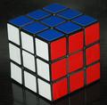
| 12/11/2003 12:34:57 PM |
simple or complex???by notonlineComment: Well, well, well, a Rubic-cube, I like it! :-) Colours and shapes are simple, maybe I would have chosen a darker level in PhotoShop and crop is too tight on the bottom, otherwise a good pic and I like it. :-) |
| Photographer found comment helpful. |
| 12/11/2003 11:56:02 AM |
Simply Loveby WildflowerJoyComment: I love the composition very much here, and the colours are brilliant, too! I love simple bonquets. :-) Maybe you could have left a few millimeters more space above and the flowers could be a bit sharper, too, but I enjoy this photo, I used to collect dry flowers years ago. |
| Photographer found comment helpful. |
| 12/11/2003 11:48:02 AM |
simple wonderby grigrigirlComment: This is a simple emotion, you are right, and I like it. :-) B&W is great for this photo, I love the eyes. For my taste, crop is too tight on the top, anyway. |
| Photographer found comment helpful. |
Home -
Challenges -
Community -
League -
Photos -
Cameras -
Lenses -
Learn -
Help -
Terms of Use -
Privacy -
Top ^
DPChallenge, and website content and design, Copyright © 2001-2025 Challenging Technologies, LLC.
All digital photo copyrights belong to the photographers and may not be used without permission.
Current Server Time: 08/21/2025 11:59:44 AM EDT.