| Image |
Comment |
| 01/29/2009 09:54:08 AM |
Shut Up!by GreatJobBobComment: Very well done. I marked it lower than some others simply because there are other photos that I like better, personally. But I wanted to let you know that I liked it very much. The only thing that bothered me was it seemed a little too centered. I'd be tempted to have the main image down in the lower left and have more counter (or whatever your background is) on the left.
thanks! |
 Photographer found comment helpful. Photographer found comment helpful. |
| 01/29/2009 09:54:07 AM |
Shhhhhhhhhhhhhby aKiwiComment: I like the breaking of the rules. Usually you leave more room on the left when the person is facing the left. but bringing it to the edge draws your eyes in to the flowing hair.
Two very small issues: the wisp of hair showing on the left is distracting (extra fan to make sure it's all blowing back since you can't photoshop it?), and having her move the finger more to the left so that it's centered more on the mouth. It's a really small thing, but I liked this picture very much, but something bothered me the more I looked at it. So I thought you might be interested...
very, very nice shot |
| Photographer found comment helpful. |
| 01/29/2009 09:54:04 AM |
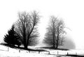
februaryby tnunComment: very nice. I originally thought that there was too much contrast, and too much detail lost in the trees, but actually, I think it works! |
| Photographer found comment helpful. |
| 01/28/2009 08:37:01 AM |
Silence: ASLby ErikTurnerComment: interesting idea, but I find the color cast and the shadow behind his head distracting. I think you'd lose the shadow, and bring your subject out more (the wall texture is a little distracting as well...) by bringing him out and away from the wall. Also, I'd recommend fixing the color cast in Photoshop (perhaps a cooling filter?) |
| Photographer found comment helpful. |
| 01/28/2009 08:33:16 AM |
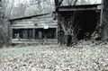
Idle Barnby npaselComment: nice subject, but it came through a little fuzzy. Perhaps sharpening in photoshop would have helped? |
| Photographer found comment helpful. |
| 01/28/2009 08:22:57 AM |
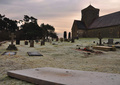
When The Bells Stop...by SurreyHighlanderComment: it's a wonderful idea, but it seems a little muddy to me. There's not enough definition to the tombstones because of the trees behind. perhaps a different angle would make them more prominent? |
| Photographer found comment helpful. |
| 01/26/2009 06:02:00 PM |
|
| Photographer found comment helpful. |
| 01/26/2009 05:58:40 PM |
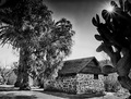
Santa Maria de Los Peñasquitos Adobeby boyd2000Comment: I would have liked it better without the cactus on the right. The texture of the stone and the texture of the left tree are very harmonious. The cactus is too dark, too blobby, and too intrusive. If it could have been framed without the cactus, I would have given it a 10--the rest is wonderful! Thank you for entering it. |
| Photographer found comment helpful. |
Home -
Challenges -
Community -
League -
Photos -
Cameras -
Lenses -
Learn -
Help -
Terms of Use -
Privacy -
Top ^
DPChallenge, and website content and design, Copyright © 2001-2025 Challenging Technologies, LLC.
All digital photo copyrights belong to the photographers and may not be used without permission.
Current Server Time: 09/01/2025 06:15:43 AM EDT.