| Image |
Comment |
| 05/12/2005 08:58:21 PM |
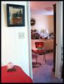
A Curious Shrineby RKTComment: This photograph has a rather surreal feel to it, which I kind of like. On a technical note, the way the scene is lit is not particularly good at directing my attention toward the interesting parts of the image. The white wall on the left is dramatically brighter than anything else in the image, while the room beyond is relatively dark. The strong difference in brightness combined with the strong dividing line of the door frame makes this feel almost like two separate images. Without the other side of the door frame on the right side of the image to anchor the scene, I'd be tempted to think that this picture contained two unrelated compositions.
|
 Photographer found comment helpful. Photographer found comment helpful. |
| 05/12/2005 08:49:51 PM |
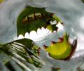
Scary Things are Following Me!by debitiptonComment: If you were going for scary or bizarre you might have been better off cropping this in a way that removed the feathers. The light is not particularly good, as the subject (the turkey's face and palea) is somewhat in shadow and his back seems to be highlighted. |
| Photographer found comment helpful. |
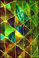
| 05/12/2005 08:31:17 PM |
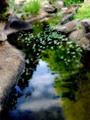
Enchanted Forestby om10Comment: There seems to be glare which washes out the center of the image. I don't generally care for photographs which are so saturated, but it seems appropriate in this case. I think that the image would have been stronger if the tree trunk and brown grass had been cropped out of the foreground. Alternatively, if you'd have rendered the periphery of the image (including the tree and dead grass) in B&W and only saturated the center of the image, the contrast between the "real world" and the enchanted forest would have been heightened. I'm not sure that editing like this is possible within Advanced editing rules, but it would be worth investigating. |
| Photographer found comment helpful. |
| 05/12/2005 08:22:50 PM |
|
| Photographer found comment helpful. |
| 05/12/2005 08:19:38 PM |
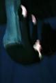
Falling into oblivionby JinjitComment: This would have looked less like an upside-down camera and you standing on the floor if your legs were bent somewhat at the knees. Textures or bright lights streaking past in the background would also have helped with the illusion. |
| Photographer found comment helpful. |
| 05/12/2005 08:16:07 PM |
|
| Photographer found comment helpful. |
| 05/12/2005 08:14:43 PM |
A Room with a Viewby TuckersmomComment: I like the combination of rich, earthy colors. However, I don't particularly care for the strong shadow behind the stoneware pot. I think that you would have been able to cut through a lot of the haze that's visible against the land rising up on the other side of the water if you had used a UV filter. |
| Photographer found comment helpful. |
| 05/12/2005 08:11:40 PM |
Restoring one of my own....by AzrifelComment: The rich textures brought out by the sepia tones are my favorite part of the image. My least favorite aspect is the writing on the sail. I'm sure that it would have earned you more than a few complaints about the crop, but I would have preferred this image if it was cropped just a bit below the letters and included more horizon off to the sides. |
| Photographer found comment helpful. |
| 05/12/2005 08:05:27 PM |
Wet Coloursby msdoubletroubleComment: It would be easier to appreciate this if the image was larger. I don't think that the portrait orientation works particularly well for this subject. |
| Photographer found comment helpful. |
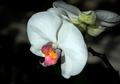
| 05/12/2005 08:01:18 PM |
Abstract Hot Mama!by GallatinComment: Your title seems to have a rather disconnected relationship with the accompanying picture. Is that the flower's natural coloration? I think that you should have gone for a more abstract macro shot of just the brightly colored portion contrasted against the surrounding white petals. |
| Photographer found comment helpful. |
Home -
Challenges -
Community -
League -
Photos -
Cameras -
Lenses -
Learn -
Help -
Terms of Use -
Privacy -
Top ^
DPChallenge, and website content and design, Copyright © 2001-2025 Challenging Technologies, LLC.
All digital photo copyrights belong to the photographers and may not be used without permission.
Current Server Time: 08/21/2025 02:57:58 PM EDT.