| Image |
Comment |
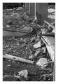
| 05/12/2005 10:15:44 PM |
The worst nightmare, total destruction!by gthbComment: The row of pillars leads my eyes toward the top of the image, while the white pole and piece of cloth draw my attention back to the foreground. A shallower DOF to direct my attention to something in particular, or a more human element (e.g. a shoe, a picture frame with shattered glass) would have helped this image to stand out from the others in the challenge. |
 Photographer found comment helpful. Photographer found comment helpful. |
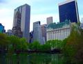
| 05/12/2005 10:09:15 PM |
Living like a Kingby RulerZigzagComment: This is a nice cityscape, but without a clear focal point (e.g. a person in the foreground, a boat on the water) or a little more effort from the title, it seems rather loosely associated with the challenge topic. |
| Photographer found comment helpful. |
| 05/12/2005 10:07:01 PM |
Garden Dreamby daisy77Comment: I like the composition in general, but the umbrella seems rather out of place and prevents me from getting a good look at the focal point of the image. I like the rich green throughout the image, but I think that the scene would have benefited from a little more color disbursed throughout, particularly in the empty-looking space above and behind the umbrella. Good use of DOF and the path to lead my eyes to the focal point of the image. |
| Photographer found comment helpful. |
| 05/12/2005 10:03:01 PM |
Nightmaresby ArcanistComment: If this had been illuminated by flickering flames the shadows might have concealed the lack of detail on the skulls which reveal that they are small, cheep bits of plastic. |
| Photographer found comment helpful. |
| 05/12/2005 09:59:41 PM |
Walking to Waterby madhatterComment: This image is interesting, but I think that it would have been a bit better if the footprints made their way onto both sides of the frame. This would have been much stronger if, in addition to the footprints, you showed the feet actually walking on the water. Since seeing sand squishing up around the edges of the feet would spoil the effect, having the person suspend themselves from a nearby pier or something would allow you to have their feet in contact with nothing but the water. |
| Photographer found comment helpful. |
| 05/12/2005 09:48:36 PM |
Tunnel visionby LevTComment: This is an interesting abstract. I like the feel of the image, but I would have preferred a slightly less cluttered view of the outside. Did the blur come from the light being distorted by the tunnel, or was the picture taped to the end of the tube while the camera was rotated? I like the effect, but I think that (if the latter procedure mentioned above were used) moving the camera forward with the image taped onto the tube may have resulted an a more interesting 'moving yet staying still' feeling. |
| Photographer found comment helpful. |
| 05/12/2005 09:39:53 PM |
Wetby srdanzComment: I would have liked this better if the water droplets were a bit sharper. More negative space or a narrower DOF might have helped as well. Although this makes an interesting abstract, it might have been more interesting if the drops were flying toward / colliding with something. |
| Photographer found comment helpful. |
| 05/12/2005 09:32:44 PM |
Dreamin' of Homeby rayg544Comment: I think that the placement of the apparition relative to the pole in the background helps to obscure one of the main elements of this photograph. I like the placement of the figure on the left of the frame approaching the sign. There's probably little you could have done about the light on the near side of the building, but having that turned off or covered up for even half of the exposure would have helped to even out the light. I like the feel of the tracks and the roof line receding into the distance. The composition may have been stronger if taken at an angle which emphasized the track a bit more (e.g taken from a bit farther back and turned slightly more toward the vanishing point) and showed the figure walking away from the camera toward the distant horizon. |
| Photographer found comment helpful. |
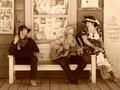
| 05/12/2005 09:06:19 PM |
Serenaded in my Dreamsby BAMartinComment: Something about this image feels overly posed. The contents of the window behind the bench are distracting, and contribute to the feeling that the "western" theme is only an act, without which the image quickly becomes rather uninteresting. The sunglasses hanging from the woman's collar don't reinforce the old west theme either. |
| Photographer found comment helpful. |
| 05/12/2005 09:01:09 PM |
Dreamscapeby uberman1cComment: I think that you might have emphasized the scene a bit more if the sun were somewhat more occluded. As it is, the brightness difference between the sun and the rest of the image is so large that my eyes keep going back to the sun, even though I know that there's nothing interesting in that part of the picture. |
| Photographer found comment helpful. |
Home -
Challenges -
Community -
League -
Photos -
Cameras -
Lenses -
Learn -
Help -
Terms of Use -
Privacy -
Top ^
DPChallenge, and website content and design, Copyright © 2001-2025 Challenging Technologies, LLC.
All digital photo copyrights belong to the photographers and may not be used without permission.
Current Server Time: 08/21/2025 12:52:45 PM EDT.