| Image |
Comment |
| 09/03/2005 10:31:39 PM |
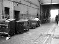
Dumpsters & Litterby kevrobertsonComment: Focusing on either (1) the drain and surrounding bricks or (2) the blocked fire exit might have resulted in some interesting images. But as currently presented this isn't a particularly interesting scene. |
 Photographer found comment helpful. Photographer found comment helpful. |
| 09/03/2005 10:27:16 PM |
|
| Photographer found comment helpful. |
| 09/03/2005 10:23:31 PM |
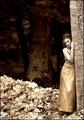
Dark & Luminousby CalliopeKelComment: This looks over-processed; I would have preferred straight sepia and perhaps a little bit of noise. |
| Photographer found comment helpful. |
| 09/03/2005 10:21:40 PM |
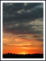
By "D"awns Early "L"ightby Buckeye_FanComment: The title is quite a stretch. The border detracts from the image. This would be a stronger photograph if there was a clear subject; sunrises are so common that they lack impact without something to fixate on. |
| Photographer found comment helpful. |
| 09/03/2005 10:18:16 PM |
Drugs & Liquorby ajschelComment: The white powder is overexposed, and the rest of the image is underexposed. Better light would do a lot for this image. |
| Photographer found comment helpful. |
| 09/03/2005 10:14:42 PM |
Flight D-Layby sammy_stecchinoComment: The title seems like a real stretch; I suspect that this would score much higher if the title didn't work against you. The fact that the cells in the grid aren't completely square is accentuated by the way you've cropped the image. Even if the windows really aren't rectangular I think that using perspective correction to make them so would have resulted in a more pleasing image. This is one of my favorite images in the challenge so far. |
| Photographer found comment helpful. |
| 09/03/2005 10:10:07 PM |
|
| Photographer found comment helpful. |
| 09/03/2005 10:00:40 PM |
Dogs & Logsby owenComment: This looks like it was sharpened way too much. This shot was well executed. |
| Photographer found comment helpful. |
| 09/03/2005 09:59:04 PM |
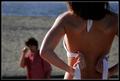
Distracting Ladyby saloonstudiosComment: A little more light on the near side of the woman would have helped to even out the illumination. Including her lower half might have improved the image. |
| Photographer found comment helpful. |
| 09/03/2005 09:54:33 PM |
Derrière & Leatherby loriprophotoComment: This isn't a title I expected to see, nor is it the image that I would have expected given the title. The scene exceeds the dynamic range of your camera on both ends, leaving the dark coat underexposed and the saddle blanket and numbers overexposed. This tutorial may have helped you to retrieve some of the missing information in these regions. |
| Photographer found comment helpful. |
Home -
Challenges -
Community -
League -
Photos -
Cameras -
Lenses -
Learn -
Help -
Terms of Use -
Privacy -
Top ^
DPChallenge, and website content and design, Copyright © 2001-2025 Challenging Technologies, LLC.
All digital photo copyrights belong to the photographers and may not be used without permission.
Current Server Time: 08/19/2025 08:55:58 PM EDT.