| Author | Thread |
Comments Made During the Challenge  |
|
|
08/17/2004 11:23:40 AM |
|
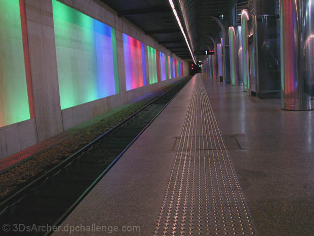
Its not just a track, its empty...like the colors |
|
 Photographer found comment helpful. Photographer found comment helpful. |
|
|
08/15/2004 10:20:29 PM |
|
No, not just not another railway track photo at all! It's one that is unique, creative and artistic. The glowing colors are very magical. The platform next to the rails is a vanishing point without the rails. Well seen and shot. |
|
| Photographer found comment helpful. |
|
|
08/13/2004 01:10:29 PM |
|
Organisation of the various planes within this shot is a bit disappointing: an amost purely graphic image should, i think/believe, be more careful with the angularity of it's subject. Your positioning of your vanishing point, and your use of colour, seems arbitrary, neither centred nor privileged, and the colour seems under-whelming, could surely have been worked up into something more impactful, or lost altogether. An annoying element is that it appears that a horizontal rather than slightly tilted presentation might have given a much more harmonious composition, placing the tunnel entrance on a much stronger area of the frame. A good idea, though, but needing more work to my eye. 5 |
|
| Photographer found comment helpful. |
|
|
08/12/2004 10:58:46 PM |
|
great title,funny and great picture . Not like the others. A definite contender. |
|
| Photographer found comment helpful. |
|
|
08/12/2004 10:47:10 PM |
|
No it is not just another railway track photo....The great colors really remedy the somethimes ho-hum same sort of thing sometimes with a train sometimes not and why do they always seem to be left justified. I mean I understand fully why the track is not centered, but the track sans train or with, always seems to be on the left.....is it me? Possibly. Back to the colors....they are wonderful and even a litle photo happy RGB thing going and I think their repititions of the reflections on the steel columns and platform also makes this unique. ALso love the textured warning path and all those lines and VP's. My only nit, and I really wish I did not have one, is that it just looks like it could use a bit of CW rotation to make it better than it already is. Great capture and good luck! |
|
| Photographer found comment helpful. |
|
|
08/12/2004 08:10:25 AM |
|
You might have called this 'not your mother's railway track photo.' Nicely done, but I might have tilted it a bit to the right. But perhaps you tried that and it looked better this way. |
|
| Photographer found comment helpful. |
|
|
08/11/2004 11:43:23 PM |
|
Thanks for getting this challenge right. I'm already getting sick of the people who don't unerstand the concept. Not only does this actually meet the challenge, but it's just a good shot. |
|
| Photographer found comment helpful. |
|
|
08/11/2004 07:47:08 PM |
|
very nice, so many vanishing points, my personal fav. so far. 10 |
|
| Photographer found comment helpful. |
|
|
08/11/2004 04:51:36 PM |
|
? This looks like Brittomart, or at least the other photos I've seen of it!... Neat wall, and you've got the white balance pretty good considering the odd lighting. The lean to the left is a little distracting though... |
|
| Photographer found comment helpful. |
|
|
08/11/2004 02:19:20 PM |
|
yes, but colorful, nonetheless... |
|
| Photographer found comment helpful. |
|
|
08/11/2004 02:11:03 PM |
|
Great composition and use of colour. |
|
| Photographer found comment helpful. |
|
|
08/11/2004 12:23:21 PM |
|
Colors are great. Might be possible for neon challenge to with some tweaking :-). |
|
| Photographer found comment helpful. |
|
|
08/11/2004 12:11:51 PM |
|
I like how colorful it is! |
|
| Photographer found comment helpful. |
|
|
08/11/2004 11:45:53 AM |
|
Is this the DC Metro? I like the colors and the angle. 9 |
|
| Photographer found comment helpful. |
|
|
08/11/2004 09:44:23 AM |
|
I like the gentle colors in this. To me, it lacks a true point of interest. The composition seems tipped--if intentional, then not tipped enough. |
|
| Photographer found comment helpful. |
|
|
08/11/2004 04:09:19 AM |
|
Please keep em coming. Since I'm stuck here in the f'ing heartland of America, I dont get to see places like this very ofter. Just trailer courts and large women wearing tight disney clothing. Yes,. God hates me. |
|
| Photographer found comment helpful. |
|
|
08/11/2004 01:21:56 AM |
|
| Photographer found comment helpful. |
Home -
Challenges -
Community -
League -
Photos -
Cameras -
Lenses -
Learn -
Help -
Terms of Use -
Privacy -
Top ^
DPChallenge, and website content and design, Copyright © 2001-2026 Challenging Technologies, LLC.
All digital photo copyrights belong to the photographers and may not be used without permission.
Current Server Time: 06/29/2026 03:08:31 PM EDT.