| Author | Thread |
|
|
12/20/2002 05:28:56 PM |
Critique Club Comment
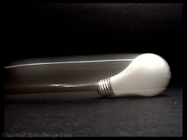
Composition : I have to agree with the other commenters that the tilt of the floor distracts. Also, finding a way to eliminate the "seam" of the wall and the floor would have helped tremendously.
Exposure/Lighting : The upper right hand background has more light than I think you intended. I got more caught up in the texture of the background then in the motion of the bulb.
Focus : I love the sharp focus on the threads in the bulbs starting place. Excellently done.
Post Processing : B/W was a excellent choice for this shot. It seems a bit grainy, but I like that aspect :)
Emotion/Challenge : You met the challenge and more :) Very interesting concept and extremely clever use of title. (Some folks say a title doesn't matter, I say some folks are wrong :) )
Opinion : This is a wonderful concept and I hope you revisit it, make a few small changes, and share the result :) I find a piece of fabric sometimes is the best background since it can be seamless... No tell-tale line where the floor ends and the wall begins. Just a thought :) |
|
 Photographer found comment helpful. Photographer found comment helpful. |
Comments Made During the Challenge  |
|
|
12/15/2002 07:48:51 PM |
|
Very creative shot! Black&white works very good here. The only thing which bothers me is that the photo is so tilted. -stephan |
|
| Photographer found comment helpful. |
|
|
12/15/2002 06:22:12 PM |
|
I'd try this from a different (higher?) angle so you don't have the visible seam where the foreground surface meets the back "wall," splitting the final image of the bulb. I like the overall concept. |
|
| Photographer found comment helpful. |
|
|
12/15/2002 11:35:04 AM |
|
OK. Not too sure this one worked as well as you wanted. |
|
| Photographer found comment helpful. |
|
|
12/12/2002 09:08:36 AM |
|
nice photo, but i am distracted by the white flects of dust on the black background. i like the white light bulb against the black! |
|
| Photographer found comment helpful. |
|
|
12/10/2002 03:38:53 PM |
|
Nice effect. Lighting and focus are good. Subject matter is interesting and appropriate. 8 waltoml. |
|
|
|
12/10/2002 02:57:11 PM |
|
What pun_ishment in the title. Interesting, and also the first I've seen where the frame actually enhances the pic. Well done, and well photoshopped. |
|
| Photographer found comment helpful. |
|
|
12/09/2002 11:02:46 PM |
|
Interesting concept. I think I would have rotated the canvas so it was level with the background line was level with the picture frame though. |
|
| Photographer found comment helpful. |
|
|
12/09/2002 12:41:50 PM |
|
I DON'T GET IT...PLEASE EXPLAIN |
|
|
|
12/09/2002 12:23:47 PM |
|
|
|
12/09/2002 09:04:22 AM |
|
This looks like a photo in a art gallery ! I love the trendy look of this and the use of b/w. = 10 Shiiizzzam |
|
| Photographer found comment helpful. |
|
|
12/09/2002 04:29:58 AM |
|
| Photographer found comment helpful. |
Home -
Challenges -
Community -
League -
Photos -
Cameras -
Lenses -
Learn -
Help -
Terms of Use -
Privacy -
Top ^
DPChallenge, and website content and design, Copyright © 2001-2026 Challenging Technologies, LLC.
All digital photo copyrights belong to the photographers and may not be used without permission.
Current Server Time: 06/28/2026 05:31:29 AM EDT.