Initial thoughts Interesting composition, meets the challenge, very humorous!
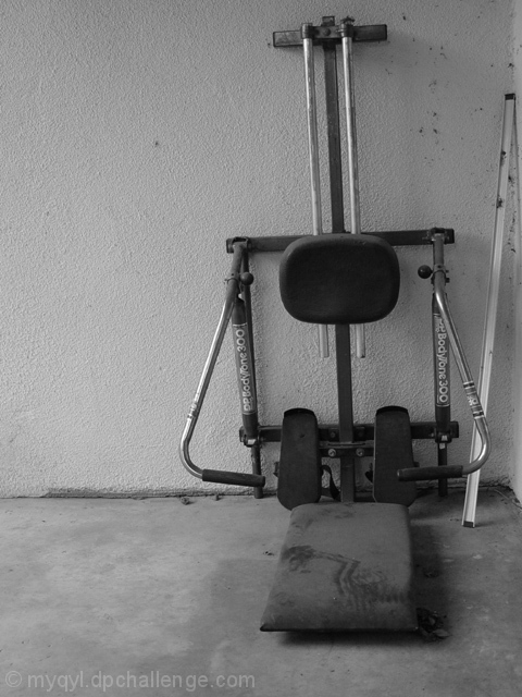
Composition/ Content Technically I like the shot. I think that having it on the right side of the frame makes it seem more "shoved in a corner". Everything there including the dust, dirt and metal piece has a discarded forgotten about look. Black and white was perfect for this shot. I like the lighting as well.
Background You'd better put "wall cleaning" on your Honey-Do list! The background is fine.
Camera Work - Technical Focus seems just a bit soft here. That may have been you intention but I feel it needed to go either a little sharper or a little softer.
Digital Processing - Technical Good work on the B & W and toning. I wonder if a border is warrented here?
Fits The Challenge Fits the challenge well.
My Opinion On The Photo I originally scored this shot a five as did most of the voters. I remember being between a five and a six. I think that it meets the challenge but was kind of depressing although humorous. This is probably what kept the score low. Good job, and keep up the good work.
I would be happy to talk further about this shot if you would like to contact me.
DougPaz
I want to thank everyone that said the dust was a good touch... I worked on that aspect faithfully for nearly a year... Glad it was worth the effort :)
I want to thank everyone that said the dust was a good touch... I worked on that aspect faithfully for nearly a year... Glad it was worth the effort :)
I feel that you could have put a little more effort into this picture and helped it a bit. The focus is soft and exposure need some more light. The spots on the wall and the extra piece of metal do not help it at all. A discarded pizza box would have been nice though.
I like the position of the exercise equipment in the frame, the dust is a good touch...but something about this isn't grabbing me. I'm sorry, I don't have any constructive suggestions, either. :-)
This is an interesting black and white study. I like all the dirt and grime, and the texturing on the wall and floor. It's an interesting commentary on our modern consumer society (if you want to get all cerebral about it :)).
It lacks something though. The photo is overall a little bit too grey, and I think I would like the shadows to be slightly longer and stronger to life the exercise equpiment from its surroundings more. The composition seems a bit too formal and static... some strong diagonal lines would help it along. Nice work though.
Those resolutions from last year frustrate us all :-) I think this shot could have had a lot more perspective if some different angles had been included. I always try to think of how a commercial or a movie maker would portray things like this. Never flat. Always use some angles to pull the viewer's eyes to where you want it. A combination of vertical and horizontally adjusted angles can do a lot. I think you meant to use the rule of thirds, but it would have been more effective if the lines at the floor and walls pulled the viewer's eyes from the corners of the shot to the rule of thirds point. As well, don't ever let these jokers convince you that EVERYTHING has to use rule of thirds. That's bunk - it's just a guideline. Center it if you feel that's strongest. Good luck!
Not really a overly thrilling image, however technically well done. I think that this has a good angle and framing/cropping. Focus and clarity are good, and the use of black and white is nice as well. Overall a well taken photo. Good luck in the challenge.
Kinda familiar.....photo raises many questions, like what's the bar in the corner for? How is it useful at that position? Why framed like this? Why B&W?
7 Swash
Good use of b&w and the RoT here, and the dust on the seat really adds to the sense of disuse. However, the shot feels slightly tilted, and may benefit from being rotated clockwise by a few degrees.
interesting black and white :) The only thing I may have done differently here would have been to remove the white 'stick' from the corner... i can't really see how it adds to the image, and it did make me look to try to figure out what it was... just my thoughts :) - setzler
This could be a more interesting photo if you had leveled the camera and removed the item in the corner. Your lighting and contrast are good, but the cropping needs to have a little more wall on the right and a level camera. I like the idea though.
The angle of the picture could be improved by leveling the ground to wall line as well as the top of the exercize thing. Black and white is fitting. The lines in the dust are a bit distracting though.
The white object leaning against the wall doesn't add anything to the shot. I think it would have been better taken out. I like how the framing makes this feel pushed into the corner. Good lighting to capture the dust and bring a dreary feeling. = 6
LOL I hurt my back on one of those and three weeks later so did my husband. Sold it!! Very good humor shot. Maybe the composition could of been improved..the bar leaning in the corner...that could go. Not a bad shot, like it.
I like the different textures of the floor, wall, and machine. I like how you can see the streaks in the dust on the seat. The off-kiltered-ness of it adds to the 'unused' feeling, I think. I think it could be a little more contrasty though.





 Add photograph to your favorites
 Add photographer to your favorites

 Photographer found comment helpful.


