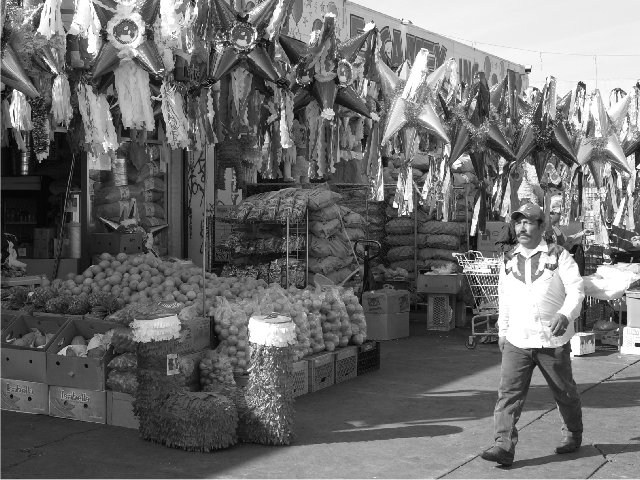
Black and white works well for this. Makes the focus on the shapes/ patterns rather than what I would expect be a riot of colour.
The person in the scene also adds a lot of interest.
I think the only problem I have with this is how it has been converted to black & white. It feels very flat, with fairly low contrast. Some additional work to make this more contrasty might have made better use of the strong shadows and made the whole picture 'pop' a bit more.
I'm shocked that so many people wanted the color here. I think that with the color, this would be horribly cluttered. There would be too much to look at. Having it in black and white lets us look at what is really interesting, the shapes. Anyway, I was the one that gave you the 9. I thought you did a nice job with this. Aside from the bright shirt, it's a great shot.
Whites are oversaturated. The subject is interesting and the man's body language and expression are interesting. Color may have also worked for this shot.
seems to me like there are some vivid colors in the photo which we might be missing out on because of the black and white. i love black and white, however, i have a suspicion that the brilliant colors of the fruit and pinatas would have given the photo more visual appeal.
This shot seems like it would have been so very colorful! (but I'm guessing!) Nice composition, framing and focus are all good. The glare off the man's shirt is a tad harsh. 7 Swash
It's a nice shot, but I think it might have been nicer with more contrast. My eyes kind of get lost in a see of gray, not enough black and white in the mid section of the photo
I'm curious to know why this was done in B&W. Looks like there are some good colorful items here. It doesn't look retro or dreary where B&W would fit. - Inspzil
Good subject. I think the man walking through/away from the market detracts a bit, though. Would have been helpful to see him doing market-things. But, this is the risk we take in photographing life-as-is. 5
This is a really interesting scene, but the contrast is a little low and white areas are overexposed. I like how you caught the guy mid-stride, and although the background is a bit busy, I think that works in an evocative way. Perhaps black and white wasn't the best decision when there must be a lot of interesting colour in this scene.
very interesting black and white shot... I love the scene here.. the lighting is maybe a tad bright from the sun.. maybe a ND filter or a polarizer would help some here... maybe that would also create a little stronger contrast... good shot :) - setzler
Nicely composed shot, with plenty of interesting details. However, it all feels very grey, as if it had been converted to b&w without any adjustments. This may be due to your monitor calibration being too dark (check by using the calibration greyscale at the bottom of all photos - you should be able to see the borders between all the blocks), but if not, it'd be worth making the whole image a bit darker and playing with the levels, to add some depth to the blacks if possible.
Nice details here. Nice framing. I like how the pinata's at the top seem to outline the man walking - lower to the right and opening up more as it moves to the left. I would be interested to see this in color. It looks as though there might be some very vibrant colors. As it is in b/w it doesn't hold my interest very long. = 6
I wonder why you choose to do this in B&W. I think that the colors must be marvolous here and my eye longs to see that. The composition is very strong and I like that you have given the man room to move across the photo.
Though I do like this shot, especially the black and white, I find that it has little emotional impact for me. I cannot decide what the subject is - whether it is the gentleman walking by, or the Christmas items, or the entire "market" itself. There seems to be so much to look at that my eyes are constantly wandering around the photo with nowhere to rest except on the man, though I do not feel that he is the "subject" of the photo. 8. lhall
Just wondering why you chose to use B/W, would have thought that there would be some interesting colours here. Overall the picture is a bright bright, could do with darkening a bit. Good Luck
the colorful market place in graytone, interesting. might have looked better in color. too many small things to differentiate one from another in black and white. very nice compostion.
It looks like this image was resized pretty poorly.... All of the detail is lost in jaggedy edges where there should be clean lines. This is a great image, though.
Im a big fan of black and white, but this shot Im thinking color would have been better. There are so many intresting items. You just know the colors had to be great.
While I like B&W photos, I really wish this one could have been in color. Looking at it I can only imagine the riot of color that must have been present. 7
wow. This is a very busy photo, however, very nicely organized. the patterns are great!! curved and pointy, round and square. very lovely. I like the use of black and white here. I think without the color, it turns it from busy, to artistic. I'm not so sure about the guy though. his shirt is very bright, and I think it might be just bright enough to draw the eyes away from the patterns in the goods. overall very very nice. Good luck in the challenge.







 Add photograph to your favorites
 Add photographer to your favorites

 Photographer found comment helpful.


