| Author | Thread |
|
|
01/15/2011 07:47:56 PM |
|
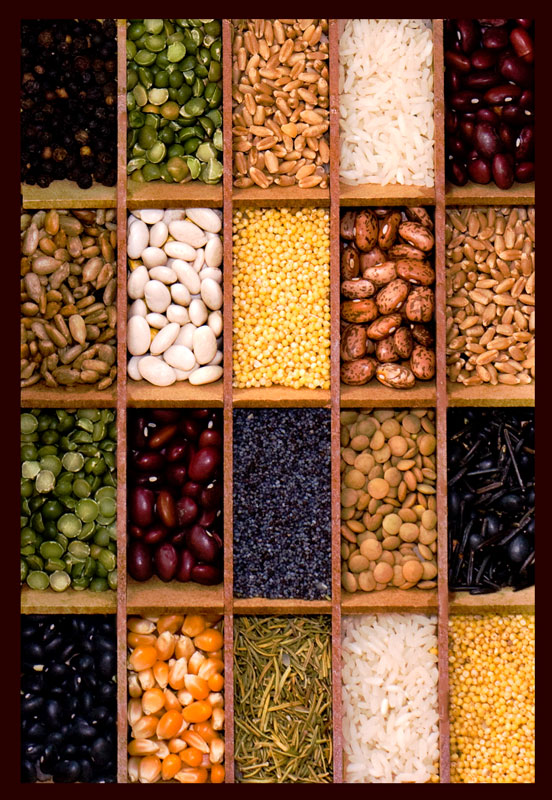
I like the deep rich coloring of this one. Great photo! |
|
 Photographer found comment helpful. Photographer found comment helpful. |
|
|
01/12/2011 03:13:10 PM |
|
I'd rather this version. Nice. |
|
| Photographer found comment helpful. |
|
|
01/12/2011 08:14:56 AM |
|
I like the portrait orientation. Looks like a kitchen poster. :) |
|
| Photographer found comment helpful. |
|
|
01/12/2011 07:48:11 AM |
|
Yes, it's better for sure! |
|
| Photographer found comment helpful. |
|
|
01/12/2011 04:38:49 AM |
|
The vertical format works better because it matches the boxes - and the pulses are better too - I wouldn't have been sharp enough to identify the flash problem - but I think she was right. |
|
| Photographer found comment helpful. |
|
|
01/12/2011 01:24:52 AM |
|
I think this is improved in every way you've changed it. (I'm not criticizing your entry.) I like the vertical presentation, the colour has more impact, and I prefer the inclusion of more of the outer boxes. The dark border suits it better too. |
|
| Photographer found comment helpful. |
|
|
01/11/2011 10:17:53 PM |
|
I like this one better than the challenge entry. There's more depth to the color. It's probably just an optical illusion, but the lines in the dividers appear to curve toward the right. |
|
| Photographer found comment helpful. |
Home -
Challenges -
Community -
League -
Photos -
Cameras -
Lenses -
Learn -
Help -
Terms of Use -
Privacy -
Top ^
DPChallenge, and website content and design, Copyright © 2001-2026 Challenging Technologies, LLC.
All digital photo copyrights belong to the photographers and may not be used without permission.
Current Server Time: 07/18/2026 07:14:22 AM EDT.