| Author | Thread |
Comments Made During the Challenge  |
|
|
07/20/2004 11:33:12 PM |
|
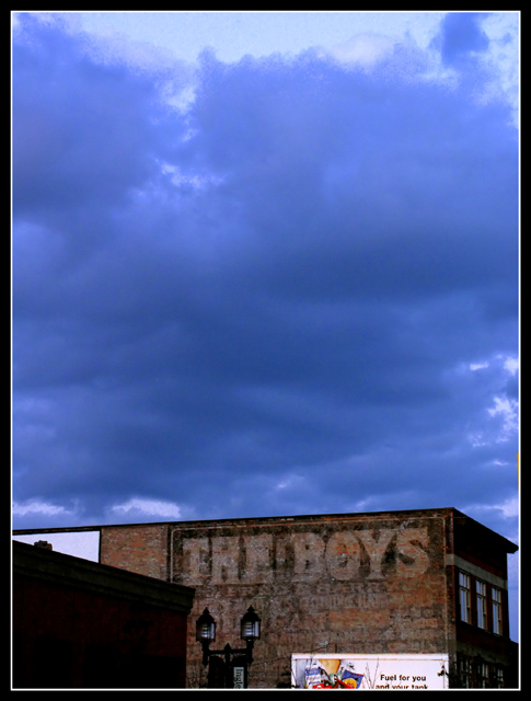
This could have more power...possibly crop the white sign out all together; dodge/burn the clouds for definition and emphasis; adjust that shadow on the foreground building; maybe bring out the color in the bricks a tad more. Good foundation; needs tweaking. :o) |
|
|
|
07/20/2004 08:04:23 PM |
|
I really think you had a great subject and a good eye for it initially. I think this shot would have done better (IMO) as a square. Try cropping it just above the white billboard and then make the height match the width and see how it looks. I think it would make a fairly powerful statement with the deep cerulean sky just above the faded out words. |
|
|
|
07/19/2004 04:22:42 PM |
|
i think you may crop it a little bit more... But i like the colors and composition. |
|
 Photographer found comment helpful. Photographer found comment helpful. |
|
|
07/18/2004 12:08:21 AM |
|
I love the color of the sky and the contrast with the lower left building. The words on the white billboard seem to be a bit 'noisy'. |
|
| Photographer found comment helpful. |
|
|
07/17/2004 10:21:32 PM |
|
I like the contrast between the blue sky and the brown building, but it might need a little clarification, I am not sure of the subject or point here... |
|
| Photographer found comment helpful. |
|
|
07/17/2004 03:14:34 AM |
|
|
|
07/16/2004 01:19:37 AM |
|
Unique kind of image, close to being well captured. It just does'nt grab me. |
|
|
|
07/15/2004 07:24:26 AM |
|
think its better if you cut that bright blue off the top, 1 or 2 cm off the top. |
|
| Photographer found comment helpful. |
|
|
07/14/2004 08:33:24 PM |
|
"Take a photograph where complete words -- not just individual letters -- play a creative role in your composition." Billboard on bottom right is out of place and distracting, same with white wall on left. No idea why this sign is important creatively to the image. |
|
|
|
07/14/2004 11:12:01 AM |
|
| Photographer found comment helpful. |
Home -
Challenges -
Community -
League -
Photos -
Cameras -
Lenses -
Learn -
Help -
Terms of Use -
Privacy -
Top ^
DPChallenge, and website content and design, Copyright © 2001-2026 Challenging Technologies, LLC.
All digital photo copyrights belong to the photographers and may not be used without permission.
Current Server Time: 06/28/2026 06:35:22 AM EDT.