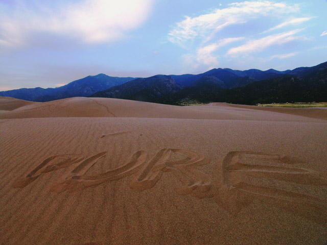
I like the color blue in the mountains. I wish the sand was lit better - more contrast? To make it hold up to the impact of the mountains and the bright sky. I might crop some off the top to bring the focus down on the word more?
I keep coming back to this one. There is something about it i like. It is a little too dark for my taste but I love the smoothness of the lines. I think I like the irony of interrupting the pureness of the sand with the word pure :)
Cool idea. I thought of doing something like this on the beach. I kindo of wish there was a bit starker shadows in the lettering so the word would stand out more but that is just a nit.






 Add photograph to your favorites
 Add photographer to your favorites


 Photographer found comment helpful.


