| Author | Thread |
Comments Made During the Challenge  |
|
|
07/04/2004 12:20:56 PM |
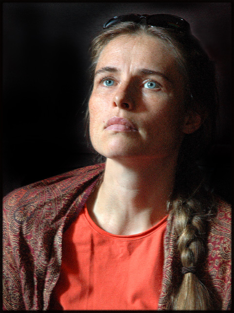
Very nicely light. I do think it could use just a touch more lighting on the right side (her left) so that her pony tail doesn't look like it's pinned to her jacket. A simple reflector on that side would do the trick. Composition is very classic if a tad bit unimaginitve. The only real complaint in my mind is the glow around her glasses. What is that? Is it from a back light?
TC |
|
|
|
07/03/2004 02:03:57 PM |
|
Lighting seems a little harsh to me, maybe especially with your title. Maybe if you were trying to convery "startled" then the brighter light and deep shadows would "fit" better. |
|
|
|
07/03/2004 09:39:56 AM |
Nice candid shot with lovely natural lighting which shows off the models blue eyes and facial bone structure to perfection.
Definite Scandinavian/German/Icelandic feel to this.
Slight halo at the top of the head..presumably you have darkened the background ? Doesn`t take away from this excellent image though.
Good work |
|
|
|
07/03/2004 03:21:58 AM |
Lighting: The catchlight adds depth to her expression, but her left side would have benefitted from some fill light.
Pose: Well posed, although I believe it would have been captured better from slightly higher than eye level.
Background: The black background was done well. |
|
|
|
07/02/2004 11:46:29 AM |
|
The back of her jacket seems to be bunched up around her neck. This, along with the wrinkles in the blouse, serve as distractions to an otherwise good portrait. I like the lighting on her face. :o) |
|
|
|
07/01/2004 08:00:03 AM |
|
What a lovely strong color studio portrait! Lighting, skin tones, focus are all great. |
|
|
|
06/30/2004 06:10:03 PM |
|
I like everythng about this except the grain. The pose is great and the expression matches the title perfectly. |
|
|
|
06/30/2004 05:38:41 PM |
|
Very good I think the right side should be a little lighter |
|
|
|
06/30/2004 01:52:05 PM |
|
Focus doesn't look sharp and it's a little noisy, but I think the lighting is good. |
|
|
|
06/30/2004 12:38:06 PM |
|
|
|
06/30/2004 10:54:34 AM |
Lighging and pose is good.
Critique: Why so serious? I would love to see a smile and remember to take off the sunglasses. :-) |
|
|
|
06/30/2004 02:44:22 AM |
|
Really dynamic - and a great study in expressions. Her eyes are definitely concentrating on "something." Keep her as a model for sure. Sunglasses are a detraction for this concept. I normally don't like borders - but this one actually works well. |
|
|
|
06/29/2004 11:53:55 PM |
|
I think this is a nice portrait, however the lighting seems a blit too dark. Her head fades into the background. |
|
|
|
06/29/2004 09:52:05 PM |
|
|
|
06/29/2004 05:33:41 PM |
|
|
|
06/29/2004 05:28:17 PM |
|
First thing I noticed was the halo on top of her head. 2nd thing was the noise. |
|
|
|
06/29/2004 02:02:47 PM |
|
Nice pose. A little more light to the right side of the face. Not sure I like the graininess it has. Makes the skin look a bit mottled. The eyes need a bit more sharper detail |
|
|
|
06/29/2004 11:12:07 AM |
|
I like the expression and the lighting, I don't care for the noise and I would like to see her shoulder turned so they are not so square to the camera |
|
|
|
06/29/2004 11:02:42 AM |
|
Looks out of focus, or motion blurred... |
|
|
|
06/29/2004 06:14:36 AM |
|
I really like this - very attractive, the slightly grainy look and the soft highlight round the hair into the background. There is another photo here too, crop to top right only face and neck - you would loose the long hair but it would make another great picture from the same material. Love the look! |
|
|
|
06/28/2004 11:56:44 PM |
blurry..looks like she or the photographer moved a slight bit
|
|
|
|
06/28/2004 09:47:57 PM |
|
Very compelling shot. Sorry 'bout the sunglasses. |
|
|
|
06/28/2004 06:55:45 PM |
|
The image noise and lack of sharpness detract from the very interesting dramatic expression and lighting |
|
|
|
06/28/2004 04:18:54 PM |
|
Your portrait is really good. I think it would have been even nicer with a closer crop to just below her neck and without the sunglasses on top of her head. |
|
|
|
06/28/2004 04:07:00 PM |
Nice expression
might have benifited from another light source
but then again that is not the look that you were going for...
Good luck |
|
|
|
06/28/2004 04:05:30 PM |
|
|
|
06/28/2004 01:08:02 PM |
|
|
|
06/28/2004 12:16:31 PM |
|
Great eyes and lips!! Fantastic face, and expression. I don't like the wrinkles in the shirt and jacket. The shoulder pad looks too big. Nice work and good luck. |
|
|
|
06/28/2004 12:38:13 AM |
|
Grainy, though the light is otherwise effective. Also, sort of has the cut-out halo still around the top of her head. |
|
Home -
Challenges -
Community -
League -
Photos -
Cameras -
Lenses -
Learn -
Help -
Terms of Use -
Privacy -
Top ^
DPChallenge, and website content and design, Copyright © 2001-2026 Challenging Technologies, LLC.
All digital photo copyrights belong to the photographers and may not be used without permission.
Current Server Time: 07/01/2026 08:13:06 PM EDT.