| Author | Thread |
Comments Made During the Challenge  |
|
|
06/27/2004 10:25:04 PM |
|
 Photographer found comment helpful. Photographer found comment helpful. |
|
|
06/27/2004 10:41:26 AM |
|
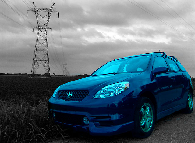
Ak! That's a strange shade of blue. |
|
| Photographer found comment helpful. |
|
|
06/27/2004 07:49:14 AM |
|
why are the windows and everything so blue, it looks un-realistic. |
|
| Photographer found comment helpful. |
|
|
06/27/2004 01:22:22 AM |
|
It's a good desaturation job, but i think it looks fake b/c of the colored windows- might desaturate the windows while leaving the bodies blue. And the hubcabs- that would be my suggestion |
|
| Photographer found comment helpful. |
|
|
06/24/2004 11:41:10 PM |
|
too much blue in the car, not realistic ! |
|
| Photographer found comment helpful. |
|
|
06/24/2004 10:52:18 AM |
|
The blue tint on the wheels, headlamps, and glass makes the picture seem odd. |
|
| Photographer found comment helpful. |
|
|
06/23/2004 08:41:49 PM |
|
i'm not so sure the total blue tint was the way to go. the composition works well. i kinda like the power lines on the left, however, i would clone out the ones above the car on the right. |
|
| Photographer found comment helpful. |
|
|
06/23/2004 08:43:49 AM |
|
This would have worked much better if you hadn`t painted the whole car blue. Eliminate the tint on the windows, headlights, wheels and headlights and it would be better I think. I gota a chance to drive one of these babies as a rental in Florida. Sweet little car. |
|
| Photographer found comment helpful. |
|
|
06/23/2004 05:35:59 AM |
|
Seems as though your color balances is off. You can tell, because the grays and whites on the car are cyan. It's easily fixable in photoshop, for next time if you accident'y shoot using the wrong white balance. |
|
| Photographer found comment helpful. |
|
|
06/22/2004 11:38:29 PM |
|
I think I might have liked to see the background color in the windows and a little less saturation of the blue on the headlights and wheels. Very nice photo. :) |
|
| Photographer found comment helpful. |
|
|
06/22/2004 04:28:58 PM |
|
Good perspective and unusual location. I think the blue may look at bit too "electric" and almost glowing. The car appears to be disjointed from the rest of the picture, perhaps due to this striking contrast. Completely personal and not part of my score -- I don't find "new" cars very interesting, but enjoy pictures of classics and customs more for photography. |
|
| Photographer found comment helpful. |
|
|
06/22/2004 03:13:18 PM |
|
Did you paint the car blue instead of desaturating only the surroundings? The way to do that is to create 2 layers, desaturate the top later then erase the car from the top layer so that the colour of the car in the background layer shows up. Voila you've got a selectively desaturated image. |
|
| Photographer found comment helpful. |
|
|
06/22/2004 02:16:24 PM |
|
I like the idea, and the rendering of the sky and power lines. The blue of the car seems unnatural and makes the car seem out of place IMHO. |
|
| Photographer found comment helpful. |
|
|
06/22/2004 01:57:15 PM |
Ooooh...your blues are way oversaturated and IMHO ruins the effect...
TC |
|
| Photographer found comment helpful. |
|
|
06/22/2004 12:07:50 PM |
|
Interesting photo, however I think that the saturation on the car was way overdone. |
|
| Photographer found comment helpful. |
|
|
06/21/2004 05:25:51 PM |
|
| Photographer found comment helpful. |
|
|
06/21/2004 04:44:48 PM |
|
The desat technique itself is done well, but I think that in this particular setting it isn't working for me. It appears that you used some kind of color overlay, which really gives the car an unnatural appearance in a natural setting. I don't have a problem with the power lines or towers, and it might have helped to have used the power theme to your advantage with a different title, or maybe red instead of blue...of course, these are just my opinions. Good luck! :o) |
|
| Photographer found comment helpful. |
|
|
06/21/2004 03:45:11 PM |
|
The car is colored in, it looks out of place. |
|
| Photographer found comment helpful. |
|
|
06/21/2004 02:41:25 PM |
|
This picture immediately looked to me like you colored it instead of using selective desaturation. There is a blue tint to every part of the car. I may be wrong but that's what I see. |
|
| Photographer found comment helpful. |
|
|
06/21/2004 12:16:35 PM |
|
did you mask the entire car and apply hue/saturation? It's selective desaturation. Why not try the history brush or something similar. It might have worked a little better this way. This looks like a blue blob. Nice mask work though. |
|
| Photographer found comment helpful. |
|
|
06/21/2004 09:11:24 AM |
|
I think this would have looked better if the wheels, headlights and windows were not in blue. Otherwise a very nice composition and scene. |
|
| Photographer found comment helpful. |
|
|
06/21/2004 06:26:33 AM |
|
hmmm interesting but I'm not sure I like what you've done with the car, it would probably have looked great if it was just a blue car on a grey backing but the fiddling you've done with the car's colour has ruined it for me. |
|
| Photographer found comment helpful. |
|
|
06/21/2004 01:54:45 AM |
|
Car looks very filtered, and unnatural. |
|
| Photographer found comment helpful. |
Home -
Challenges -
Community -
League -
Photos -
Cameras -
Lenses -
Learn -
Help -
Terms of Use -
Privacy -
Top ^
DPChallenge, and website content and design, Copyright © 2001-2026 Challenging Technologies, LLC.
All digital photo copyrights belong to the photographers and may not be used without permission.
Current Server Time: 07/16/2026 06:53:37 PM EDT.