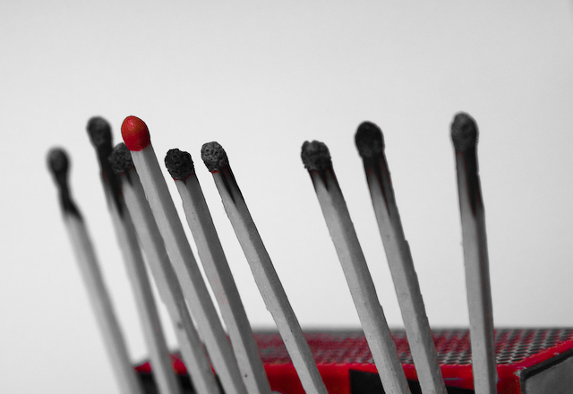
I'm sure you cut off the bottom of the image because you are hiding whatever is holding up the matches, but I think the image would be stronger if the match box was more prominent in the frame, both to add some color/take away some of the white and to put the bulk of the detail in the same place. As it is now, my eye wants to bounce between the match heads and the box.
I'm usually a big fan of shallow DoF but the two matches to the right of the unlit one are a little too in focus for the extreme oof match on the far left to work well together. I think if all the matches except the red one were more oof it would have worked better - if that makes sense.
Selective desaturation can be a very useful tool when executed effectively. Here, the red of the matchbox seems distorted and out of place. I to like the idea, but, in my opinion, all nine matchsticks should also be in crisp focus. With the challenge subject being nine, I'd like to see the nine clearly distinguished in the image. Here, one item is distinguished, but even that one has some detraction with the red in the matchbox. Definitely some potential here, but this one needs much better execution to grow your score. 3.







 Add photograph to your favorites
 Add photographer to your favorites

 Photographer found comment helpful.


