| Author | Thread |
|
|
05/04/2003 02:35:09 AM |
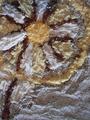
the picture speaks for itself and gets the message across pretty well. I guess saturating or adjusting the hue for RED may help improve this one further from a 5 to 6. Just my opinion.
BTW, having the same camera as yours, I'm suprised at the level of focus you got from this macro shot. Nice!
Shadow |
|
Comments Made During the Challenge  |
|
|
11/17/2002 05:14:00 PM |
|
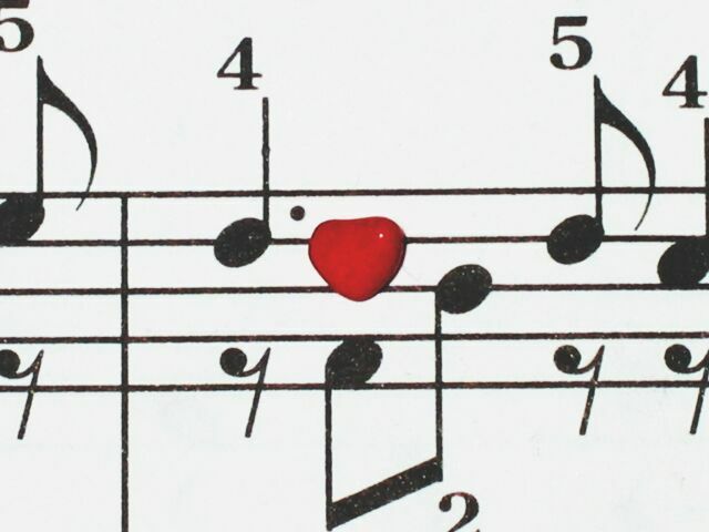
your heart is in the wrong place good idea though |
|
|
|
11/15/2002 04:45:00 PM |
|
Most definitely - vw4lyfe |
|
|
|
11/15/2002 08:00:00 AM |
|
Interesting. Good job. Jacko |
|
|
|
11/14/2002 06:11:00 PM |
|
I really like the way the red pops out in this image... I think this image would be even stronger if the red heart was not dead centered in the photo... good work though :) - setzler |
|
|
|
11/14/2002 01:01:00 PM |
|
I know I voted on this once. What happened? I even asked you if that was a cinnamon candy heart. Love the sheet music with the number assistance. Beginner's book? I love this and the title makes it. Great job. Great 8. PTL |
|
|
|
11/13/2002 09:40:00 PM |
|
Very cute idea! heh -hector |
|
|
|
11/13/2002 08:15:00 PM |
|
Great shot. My only nit is that the stanza seems a bit crooked. DPz |
|
|
|
11/13/2002 04:57:00 PM |
|
Very creative idea, I like it. |
|
|
|
11/13/2002 01:58:00 AM |
|
Very pretty. I love how it's black and white, and then a striking colour. Very pretty! |
|
|
|
11/12/2002 11:44:00 PM |
|
Some contrast adjustment, to pure blacks/whites might look cool. good idea |
|
|
|
11/12/2002 09:32:00 PM |
|
Crisp, clean, sharp, witty, with a certain playful feel to it. Very nicely done, with a very imaginative approach. lhall |
|
|
|
11/11/2002 05:47:00 PM |
Very Creative....
I love it...
I would have cleaned it up a bit by fixing the white spots on the notes and the one on the cany heart.... but again...wonderfully creative.
Cheers! |
|
|
|
11/11/2002 03:19:00 PM |
|
I really like the idea of this, and I think you have done a good job. The only negative I've got is that it looks a little "flat" (no pun intended). If there had been some way to "elevate" heart so that it cast a shadow, it may have given it a "deeper" feeling. karmat |
|
|
|
11/11/2002 03:04:00 PM |
|
Home -
Challenges -
Community -
League -
Photos -
Cameras -
Lenses -
Learn -
Help -
Terms of Use -
Privacy -
Top ^
DPChallenge, and website content and design, Copyright © 2001-2026 Challenging Technologies, LLC.
All digital photo copyrights belong to the photographers and may not be used without permission.
Current Server Time: 06/27/2026 12:14:10 PM EDT.