| Photograph Information |
Photographer's Comments |
Challenge: HDR II (Advanced Editing VII)
Camera: Canon PowerShot S5 IS
Location: Fort Worth, Texas
Date: Sep 12, 2009
Aperture: F7.1
ISO: 80
Shutter: 1/15, 1/8, 1/4, sec.
Galleries: Urban, Emotive
Date Uploaded: Sep 12, 2009
|
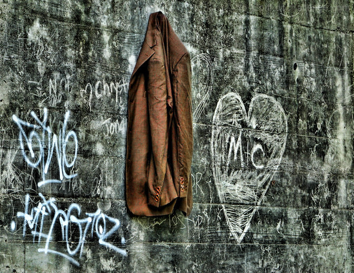
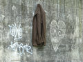
This is an abandoned building tucked up right under downtown Fort Worth, behind the jail and overlooking the river.
The homeless regularly use it as shelter, and one of them left this jacket hanging on a nail. My original intention was to try (again) to get a photo of this interesting abandoned building, but I can never get the building to stand out from the surrounding trees well enough to satisfy me.
My thought with the title was "Home is where you hang your hat", but it's a jacket, not a hat, or "Home is where the heart is", but the heart graffiti heart on the wall does not bring much love for the residents of this place. I decided to leave the exact interpretation up to the viewer, but still wanted to make it clear that someone resides here.
-Photomatix basic (freeware version) to merge 3 JPG exposures, 1 stop apart. (SLR is out of commission, so I am using my Powershot S5)
-A light dusting of Topaz detail
-Followed by Topaz Adjust
-Then some PSP clarify.
-Then I duplicated, Gaussian blurred the dupe and multiplied. Masked the dupe toward the middle in order to slightly darken the outer part of the image.
-Then cranked up the red a bit to draw the eye to the jacket a little more.
-Resize, sharpen and save. Had to use a little more compression than I would like, but I am probably the only one anal enough to notice it.
This is the out of the camera version of the medium exposure:
Pre-challenge notes:
Not a clue how this will do. I may be in for another low 5, as I expect to be competing against lots of fantastic eye candy from some very skilled people.
Anticipated critiques:
-Composition is too centered. (Agreed, but I could not compose this to my liking any better. I had several other perspectives, but did not like them as much.)
-Don't understand what is being conveyed by this scene
-Too heavy handed with the tonemapping. Looks cartoony.
-Not heavy enough with the tonemapping. Not enough of an HDR look to it.
Post-challenge notes:
My prediction was way off, and this turned out to be a very good one for me. The #5 spot on my profile page, #4 spot on the Powershot S5 page, and even  Posthumous liked it. Did way better than the first HDR shot I entered of this place. Posthumous liked it. Did way better than the first HDR shot I entered of this place.

No complaints here! |
| Author | Thread |
|
|
02/22/2010 11:16:44 PM |
|
This is really really cool... |
|
 Photographer found comment helpful. Photographer found comment helpful. |
|
|
09/21/2009 10:21:02 PM |
|
I was one of your 8's. I really like the color contrast of the coat with the concrete and chalk - besides it being outdoors. The HDR really made the textures of the coat stand out. |
|
| Photographer found comment helpful. |
|
|
09/21/2009 12:21:05 AM |
|
I thought this was cool. The processing made the jacket almost seem to float off the wall. Glad to see you were off in your score prediction! |
|
| Photographer found comment helpful. |
|
|
09/21/2009 12:11:10 AM |
|
I liked this. I gave it a 6. One of my best 6s. I only gave 5 photos a score higher than 6. |
|
| Photographer found comment helpful. |
|
|
09/21/2009 12:05:29 AM |
|
well you did something right:) kicked my ass quite well. great score, and the edit you entered has really grown on me |
|
| Photographer found comment helpful. |
Comments Made During the Challenge  |
|
|
09/20/2009 12:40:24 PM |
|
The HDR really brings out the details in the brick, especially the writing. I really love this one (didn't vote). |
|
| Photographer found comment helpful. |
|
|
09/19/2009 10:41:54 PM |
|
Unique image and presentation. |
|
| Photographer found comment helpful. |
|
|
09/18/2009 04:03:40 PM |
|
i still really like this. not sure i like the blue graffiti sticking out as much as it is. and i would have preferred a slightly different crop. but i still like it:) no vote |
|
| Photographer found comment helpful. |
|
|
09/18/2009 02:16:05 AM |
|
Nice concept. Simle and effective. |
|
| Photographer found comment helpful. |
|
|
09/16/2009 10:22:38 PM |
|
Whats that hanging on? Nice HDR!!! Nice grunge and texture detail. Interesting wall art, love this shot and how the coat stands out against the wall. |
|
| Photographer found comment helpful. |
|
|
09/16/2009 10:00:38 AM |
|
Good image here, well executed. |
|
| Photographer found comment helpful. |
|
|
09/15/2009 01:55:32 PM |
I shall be rating this challenge by the following criteria:
1 - Not HDR in my opinion
3 - HDR is way over-done, in my opinion
5 - A reasonable use of HDR, but not a very engaging photo, in my opinion
7 - A reasonable use of HDR, and an engaging photo, in my opinion
10 - A fantastic use of HDR, and an out of this world photo, in my opinion
Your photo receives:
3 |
|
| Photographer found comment helpful. |
|
|
09/14/2009 07:29:52 PM |
|
Not sure exactly why, but this is SUPER cool to me... |
|
| Photographer found comment helpful. |
|
|
09/14/2009 02:35:16 PM |
|
| Photographer found comment helpful. |
|
|
09/14/2009 08:38:04 AM |
|
Almost has a 3D effect. I like it. |
|
| Photographer found comment helpful. |
|
|
09/14/2009 02:31:22 AM |
|
| Photographer found comment helpful. |
|
|
09/14/2009 01:43:09 AM |
|
| Photographer found comment helpful. |
Home -
Challenges -
Community -
League -
Photos -
Cameras -
Lenses -
Learn -
Help -
Terms of Use -
Privacy -
Top ^
DPChallenge, and website content and design, Copyright © 2001-2026 Challenging Technologies, LLC.
All digital photo copyrights belong to the photographers and may not be used without permission.
Current Server Time: 06/27/2026 08:32:54 PM EDT.