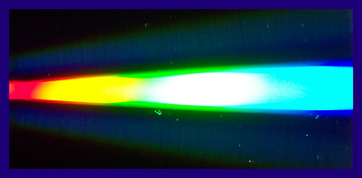
This is just a light reflection on a CD. This was an outtake of the Burst of Color II challenge. Not a whole lot of edition other than some USM, color saturation, rotation, crop, and frame.
I know I will be competing with marvelous shots in this challenge and this is actually not my best one, but I wanted to post something different.
Statistics
Place: 1104 out of 1129 Avg (all users): 3.8225 Avg (commenters): 4.2391 Avg (participants): 3.7553 Avg (non-participants): 4.1884 Views since voting: 913 Views during voting: 619 Votes: 445 Comments: 48 Favorites: 0
OMG!!! I was SO close to getting my first ribbon! Shame it was going to be a brown one though! LOL
I really want to thank you all who took the time to rate and even comment on my picture. This if the first time I got so many comments, and I truly appreciate them. To those who were wondering what this was, there is a comment to it, but it was a very simple shot. I knew it was not going to do really well, although I honestly didn't think it was going to do this bad! I must admit, I keep my monitor rather dark, and I noticed that if I increase its brightness, my picture can be a bit too harsh. It should have been darker. I have to remember from now on that I actually see things darker than they really are! I didn't clone out the dust, since that was supposed to be the star field!
I also want to apologize for mispelling my title, it's "across" not "accross". I had realized that, but I couldn't change it anymore, and then someone else noticed it too!! LOL Oh well!
Anyway, thanks again for your patience in voting and commenting. There were SO many wonderful shots in this challenge!
PS: popdeepop, where you just kidding about buying this!??? if you were not, it's yours, its price is 0.00!
I can only say I don't like this...not because I don't know what it is but for me there is no definition, no texture and it appears to have noise that doesn't work here. I like soft but this doesn't work for me as soft either.
The color spectrum you picked up here is out of this world (sorry, couldn't help myself). Seriously, I really do like the colors. The abstract quality of this is kinda cool.
I'm not sure why, but this just doesn't do it for me. Normally I'm a fan of abstracts. Maybe the colors are just too garish. I think the border doesn't help the cause.
I have no idea what this is, but the colors are really neat. Not digging the border though. And as this is advanced editing, you could have cleaned up all those distracting spots.





 Add photograph to your favorites
 Add photographer to your favorites


 Photographer found comment helpful.


