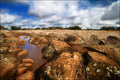
Nice I guess... but when you have a horizon in a shot it just has to be level unless you went for a drastic effect by tilting it. But that doesn't look appropriate to me for this particular image. The sky looks nice though.
lovely location - the stars in the upper left are a nice touch but the large rock dead center seems to overwhelm the scene a bit and makes it hard to see both the right and left at the same time
A nice image overall, however a little bit more space given to the foreground in order to include the full reflection of the main rock formation may have benefited this composition. A slight slant of the horizon to the left is also noticeable, not much but visible nonetheless! I'm nit picking here, but as a master's challenge, I feel I ought to judge it as such and will mark you a point down as a result. Normal FS = 7, this challenge = 6.







 Add photograph to your favorites
 Add photographer to your favorites


 Photographer found comment helpful.


