| Author | Thread |
|
|
12/08/2008 01:34:39 AM |
|
The more I look at this the better I like it. Probably underrated in the voting. Well done. |
|
 Photographer found comment helpful. Photographer found comment helpful. |
Comments Made During the Challenge  |
|
|
12/06/2008 06:12:27 PM |
|
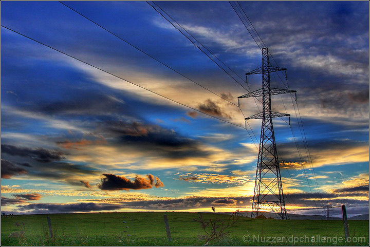
Interesting edit of saturation around the power lines themselves. Not sure whether I like it or not. Nice dramatic sky. |
|
| Photographer found comment helpful. |
|
|
12/05/2008 03:17:28 PM |
|
The sharpening might be a bit much. The power lines in the foreground seem to have halos and take slightly from the continuity of the sky. Otherwise, stunning. |
|
| Photographer found comment helpful. |
|
|
12/05/2008 09:49:17 AM |
|
Wow, beatutiful, great colors and depth. |
|
| Photographer found comment helpful. |
|
|
12/04/2008 07:18:32 AM |
|
Great colours, makes quite an interesting subject with the pylon in the distance ... would be cool if there were even more though. I find the processing a little extreme thought for my liking |
|
| Photographer found comment helpful. |
|
|
12/02/2008 09:36:39 PM |
|
You've done a good job making an ugly thing pretty here. (not voting yet) |
|
| Photographer found comment helpful. |
|
|
12/02/2008 09:36:34 PM |
|
odd banding in the sky, far too over processed for my tastes |
|
| Photographer found comment helpful. |
|
|
12/02/2008 08:06:15 AM |
|
overly and/or wrong use of shadows/highlights produced ugly glow everywhere. too juch sturation, too. composition is good. |
|
| Photographer found comment helpful. |
|
|
12/01/2008 09:47:15 AM |
The one thing I've noticed with tone mapping and HDR, is that if there is a line, the tone mapping breaks up the background. Kind of like the far left wire. The right side of the cloud is dark, but then on the left side of the wire it's light. So the wires make that part of the sky really uneven.
It's a nice looking shot, but the uneven tone mapping ruins it for me. |
|
| Photographer found comment helpful. |
|
|
12/01/2008 05:06:16 AM |
|
It's OK, but the sky looks a little plastic...6 |
|
| Photographer found comment helpful. |
Home -
Challenges -
Community -
League -
Photos -
Cameras -
Lenses -
Learn -
Help -
Terms of Use -
Privacy -
Top ^
DPChallenge, and website content and design, Copyright © 2001-2026 Challenging Technologies, LLC.
All digital photo copyrights belong to the photographers and may not be used without permission.
Current Server Time: 06/28/2026 12:12:06 PM EDT.