Author Thread
Post actions
amazin shot nice calm feelin!!
Comments Made During the Challenge
Post actions
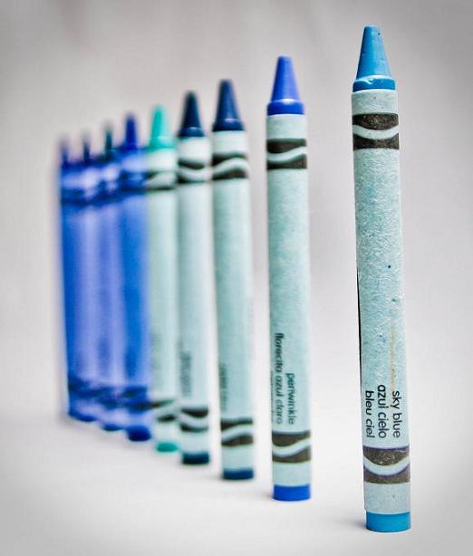
I like the concept a lot, although doing it with a hue/shade graduation would have solidified it. Dark to light, light to dark. This just seems more random than anything.
Post actions
Post actions
Post actions
Nice! I would have used the two colors only that make blue when combined....great shot though..love it
Post actions
Nicely executed I guess but I don't find the crayons very attractive for a photo. Would you hang this on your wall or anywhere else?
Post actions
I think I would have liked it more with the darker hues in the foreground.
Post actions
Cool idea, feels a little overexposed. Would like to see a version where a color in the middle was in focus rather than the one on the end.
Post actions
this would have been much stronger with focus on another crayon (for example the third one). As it is now, the last five are too blurry for my taste
Post actions
Nice idea. Maybe having the first two closer together...?





 Add photograph to your favorites
 Add photographer to your favorites

 Photographer found comment helpful.


