| Author | Thread |
|
|
05/05/2004 09:00:16 AM |
|
Thanks to everyone who voted & posted comments on my entry in the Proportions Challenge. |
|
Comments Made During the Challenge  |
|
|
05/04/2004 10:11:59 PM |
|
nice pretty background.....great lighting on your subjects!! |
|
 Photographer found comment helpful. Photographer found comment helpful. |
|
|
05/04/2004 06:37:41 AM |
|
pretty, elegant, perfect background |
|
| Photographer found comment helpful. |
|
|
04/30/2004 09:07:07 PM |
|
Nice idea and interesting lighting. Maybe propping the smallest bow on an angle to the one next to it might give the shot a little more depth. |
|
| Photographer found comment helpful. |
|
|
04/29/2004 06:52:22 AM |
|
| Photographer found comment helpful. |
|
|
04/28/2004 09:03:51 PM |
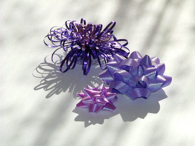
The subect leaves me cold. I'm utterly uninterested in the idea of bows coming in different shapes and sizes. Who cares? The bows aren't doing much but sitting there in the middle of the frame.
Adendum: Sorry I was so blunt in my commenting. I must have been feeling really cranky by the time I got to this photo. Here's a more objective critique, as if you care what I think, at this point. :D
I think I was responding as much to the title as the actual image. I must have been feeling very literally minded that day. The colors in the bows are nice but I think this arrangement could have been thought out a bit more carefully. The direction of the light creates a harsh shadow and creating a lot of distracting hot spots on the bows. I actually thought you used a flash because of the dark shadows and the rather cold cast to the overal image. Positioning them smack in the center of the frame like this creates a lot of uninteresting negative white space and makes for a rather static composition. A possibility might have been arranging them in a container (a glass bowl perhaps?) like a floral or fruit arrangement, along with a few more bows (as long as it's an odd number). The white background is kind of a harsh contrast to the jewel colors of the bows. A rich, drapey fabric might have worked well. I'm still not nuts about this photo but that is just one person's opinion and you can just tell me to pound sand if you want. But now at least I've given my reasons why it doesn't work for me. Sorry for being
mean about it earlier.
Message edited by author 2004-05-08 00:36:39. |
|
|
|
04/28/2004 12:00:44 PM |
|
a tighter crop would help the composition IMHO, of course |
|
| Photographer found comment helpful. |
|
|
04/28/2004 04:32:31 AM |
|
The colors are great and also the shadows |
|
| Photographer found comment helpful. |
Home -
Challenges -
Community -
League -
Photos -
Cameras -
Lenses -
Learn -
Help -
Terms of Use -
Privacy -
Top ^
DPChallenge, and website content and design, Copyright © 2001-2026 Challenging Technologies, LLC.
All digital photo copyrights belong to the photographers and may not be used without permission.
Current Server Time: 06/29/2026 05:20:45 AM EDT.