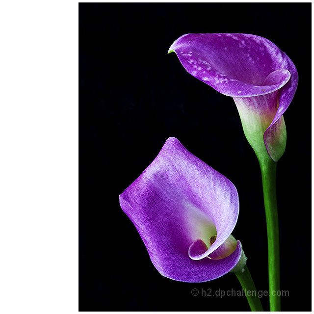
Post challenge: Hmm, seems like somebody didn't like the border (or just didn't have anything else to comment). I don't think it distracts, but, as undieyatch formulates it, balances out the whole composition.
Statistics
Place: 34 out of 227 Avg (all users): 6.0990 Avg (commenters): 6.6190 Avg (participants): 5.8293 Avg (non-participants): 6.2833 Views since voting: 1347 Views during voting: 315 Votes: 202 Comments: 29 Favorites: 3 (view)
I actually love the white frame border as it is, as it gives it a graphic professional look to the image. Almost like a card or print. You also know I love the 'square crop' format, so you won me over just with that. Just beautiful mate, and adding it to my favorites.....
I'm suprised this hasn't made yanko froth at the mouth yet. He was DQ'd for a very similar (if not practically identical) border. Which is why it was familiar to me. I thought this might have been from him, seeing if he'd get DQ'd again.
A great photo of the Flowers. They are sharp and really stand out against the Black Backdrop which is greta. The Light is done well.
However, I don't see the point of the wide border on the Left. It detracts for me. A simple which border around this photo would have worked better.
Composition: 2 - If I didn't count the massive white on the left it woulda been a 7 for composition
Technical: 5 - Again, the oops on the border cost you on the technical points as well
Creativity: 6
Appeal: 5 - Did I mention that big white space on the left?
Challenge: 7
Overall Calculated Average Score: 5
I assume the border was a mistake and it sucks getting hammered on that, but that's the reality - maybe not as bad as "oops, I left the lens cap on, but there really was an incredible shot behind it" but we vote on the final presentation. Now, if you meant to make the border like that, I apologize for thinking it was a mistake, but it still very much affects my opinion of the overall image.







 Add photograph to your favorites
 Add photographer to your favorites


 Photographer found comment helpful.


