I gave you a 6... mostly for the title. I wouldn't go so far as to call it a bad pic but an average pic with a crappy title, takes the pic down with it. As for the pic, sometimes (and in this case) less is more.
I look forward to your next entry.
Very cool. There are some serious optical illusions happening around the 'transition' point, if my poor brain can even figure out where the transition is, as it keeps moving!
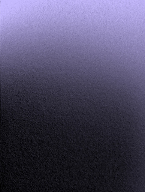
I just had another look at this on my PC at work, where I have my monitor calibrated. With a calibrated monitor there is a LOT more fine detail and subtle shading visible.
This photo came up in one of the forums, so I thought I'd stop by. (I don't vote anymore, I spend my time in the Critique Club. There are so few of us left.)
I really like this image. Minimalist images are easy to do, but the devil to do well. I like the purple, I like the shading. What I really like is that the shading seems to move, or shimmer. If you look closely an slowly follow the light down the image, you can see further and further as your eyes a adjust. But then the brighter area at the top will pull your eye back, and then you can't see as far down the image until you work at it again. What a cool visual effect!
It's the way the whole minimalist thing works. At first it appears there is not much there. But the more you explore, the more you find. But at the same time, sometimes you lose a little ground.
Yup. Thought this was yours. Abstracts generally do poorly here, but you knew that. Appealing to a handful of people that appreciate these things is a good goal however, and I think you hit it. I see that 28 people (myself included) though it was worth a 6 or above and 4 of them really liked it with a 10.
Looking forward to seeing how you do in the abstract b/w challenge this coming week.
I've got a good guess as to whose entry this may be. I recognize the style of both the image and the way it it titled. Abstracts have a tough time here, but it's a nicely detailed texture and interestingly lit. I think others may critique you for the explanatory part of the title, though it was probably needed.
Firstly I cant see the purple. And then I think I can. And then I think I cant again.
And then I think "Maybe I dont understand this because I dont appreciate artistic genius".
But then I go " Hang on a minute...maybe its just a dull picture".
Then I go "Whoever took this picture has me thinking about it for at least 30 seconds, is this the effect they wanted?"
Then I think "Its still very dull".
But then I think....At least its not another picture of a bee on a purple flower. And its not a purple sunset.
Now I see my reaction to this shot and realise I have to give you 10/10.
Good job!
ermmm... I'm lost on the focus of this photo, and it may help if it were a bit more purple, as at first glance it looked grey. Good gradiation and lighting on a positive note, but I'm afraid this really doesn't do anything for me.
I like your idea, I wish it was a shade more purple. The texture and abstract presentation get my attention, but the color is a little too far off from purple for me (6)






 Add photograph to your favorites
 Add photographer to your favorites


 Photographer found comment helpful.


