| Author | Thread |
Comments Made During the Challenge  |
|
|
04/27/2004 08:30:52 PM |
|
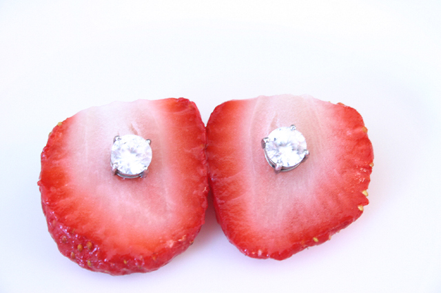
I like the idea of this shot but I wish I could see more of the structure of the strawberries (maybe the green tops still on or others in frame. The contrast is a little blown out so I'm missing the detail on the diamonds, which would be a nice contrast to organic shape of the berry. |
|
|
|
04/27/2004 03:09:38 PM |
|
background on this is too white the strawberries and diamonds dont stand out as much to see more texture with it.. |
|
|
|
04/27/2004 11:15:26 AM |
|
|
|
04/27/2004 10:19:26 AM |
|
|
|
04/27/2004 02:43:26 AM |
|
Interesting use of a high key effect - I wish the berries were a little more "au naturel" so it looked a little more serendipitous. The cutting off of the top makes it look a little overly contrived. Great concept. |
|
|
|
04/26/2004 01:15:02 PM |
|
|
|
04/25/2004 10:32:52 PM |
|
Nice idea, but focus if off and diamonds are washed out |
|
|
|
04/24/2004 03:33:48 AM |
|
maybe with other wall it could have been a 10 |
|
 Photographer found comment helpful. Photographer found comment helpful. |
|
|
04/22/2004 06:39:03 PM |
|
| Photographer found comment helpful. |
|
|
04/22/2004 03:01:45 PM |
Not sharp enuf and horribly off center. Serendipity... where?
Just my opinion. |
|
|
|
04/22/2004 05:55:05 AM |
|
good idea. i would use one diamond instead of two. punch the other strawberry with the diamond to make it more real |
|
| Photographer found comment helpful. |
|
|
04/21/2004 09:40:42 PM |
|
Too contrived for my tastes. |
|
|
|
04/21/2004 09:15:13 PM |
|
|
|
04/21/2004 07:34:32 PM |
|
Cute. I think the lighting seems kind of flat here. There's no sparkle to the stones and it seems to be too bright. |
|
| Photographer found comment helpful. |
|
|
04/21/2004 12:55:39 PM |
|
Different. Perhaps a bit too much highlite. |
|
| Photographer found comment helpful. |
|
|
04/21/2004 10:30:05 AM |
|
nice idea I wish berries were a little more centered w/ warmer lighting |
|
| Photographer found comment helpful. |
|
|
04/21/2004 07:40:07 AM |
|
Sweet, but I wish the earrings weren't so highly exposed. |
|
| Photographer found comment helpful. |
|
|
04/21/2004 04:19:50 AM |
|
The idea is great. The picture however seems to be too overexposed and personally I'd prefer to see the subject centered in this case. |
|
| Photographer found comment helpful. |
|
|
04/21/2004 01:50:16 AM |
|
The image is cliquie but the best of the bunch! Great treatment of white on red. |
|
| Photographer found comment helpful. |
|
|
04/21/2004 12:57:04 AM |
|
Over exposed...unfortunately. |
|
Home -
Challenges -
Community -
League -
Photos -
Cameras -
Lenses -
Learn -
Help -
Terms of Use -
Privacy -
Top ^
DPChallenge, and website content and design, Copyright © 2001-2026 Challenging Technologies, LLC.
All digital photo copyrights belong to the photographers and may not be used without permission.
Current Server Time: 06/28/2026 09:52:03 PM EDT.