| Author | Thread |
Comments Made During the Challenge  |
|
|
04/20/2004 10:38:23 PM |
|
|
|
04/20/2004 10:00:34 PM |
|
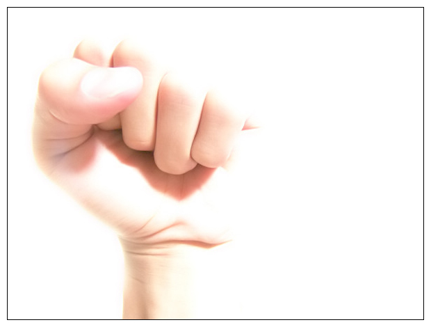
pretty blown out. on purpose, perhaps? Hard to tell. |
|
|
|
04/20/2004 02:03:23 PM |
|
I think this white technique (cant spell that) is well used here, Great composition, Good work :) |
|
|
|
04/18/2004 05:51:32 PM |
|
|
|
04/18/2004 10:33:42 AM |
|
The photo is too bright, although I like the idea. |
|
|
|
04/18/2004 05:05:51 AM |
|
Overexposed. Yes, I realize that was your intention. But I do not like it, sorry. |
|
|
|
04/17/2004 03:36:32 PM |
|
I find the lighting to harsh. |
|
|
|
04/17/2004 02:09:18 PM |
|
I'd like to see a little more color and contrast. The photo is excellent and appropriate, but a little bright for my taste. |
|
|
|
04/16/2004 12:05:52 PM |
|
Clearly overexposed - and a good thing too! It looks really cool, dramatic and ever so stylish. I very definitely love this image - very bold, simple, and did i mentiong stylish? well, it is! there is a slight possible over use of neatimage type noise reduction (though i might be wrong and whomever is modelling has incredibly smooth hands) but generally for impact, i would say this is one of my favourites. 9. |
|
|
|
04/15/2004 10:46:18 PM |
|
Way overexposed for my taste. Indicates force (maybe not strength), needs more context to stand alone. |
|
|
|
04/15/2004 03:59:16 PM |
|
Interesting image, I'm sure you'll get many comments of it being overexposed but I myself do actually like this image. It's seems to be quite rare to stumble upon high key images within challenges. Good luck. |
|
|
|
04/15/2004 11:53:48 AM |
|
Great idea; a little hot. Loses the details around the hand. |
|
|
|
04/14/2004 05:32:14 PM |
|
way too overexposed to express strength, it seems to say weakness instead |
|
|
|
04/14/2004 04:53:33 PM |
|
this image is totally blown out, and very hard to look at. Some might find it ironic that a phrase used by some miniority groups in America is being represented here by a whte hand, against a white background, with a blown-out white light washing over the entire image. |
|
|
|
04/14/2004 04:20:32 PM |
|
|
|
04/14/2004 01:13:55 PM |
|
the soft focus and high key effect doesn't really lend itself to a feeling of strength |
|
|
|
04/14/2004 08:18:55 AM |
|
Interesting take, too bad it's very overexposed. |
|
|
|
04/14/2004 07:50:58 AM |
|
Interesting message, but jsut too over-exposed for my taste. Besides, The only thing I would point out that there is a difference between "power" and "strength". Power is a more generic term, while strength is a word describing physical attributes such as raw strength and longevity. (you are by no means the only one. Check out this thread: kamps.org/g/?vkmv) I think you picture describes "power", but not "strength", and hence falls outside of the challenge. Sorry. (2) |
|
Home -
Challenges -
Community -
League -
Photos -
Cameras -
Lenses -
Learn -
Help -
Terms of Use -
Privacy -
Top ^
DPChallenge, and website content and design, Copyright © 2001-2026 Challenging Technologies, LLC.
All digital photo copyrights belong to the photographers and may not be used without permission.
Current Server Time: 07/02/2026 09:32:25 AM EDT.