| Author | Thread |
|
|
12/26/2008 09:13:27 PM |
|
lovely lighting. i like the yellow tint. the symmetry is nice, but is thrown off by the thingy on the left. over all i really like this:) |
|
 Photographer found comment helpful. Photographer found comment helpful. |
|
|
07/08/2008 02:43:15 PM |
|
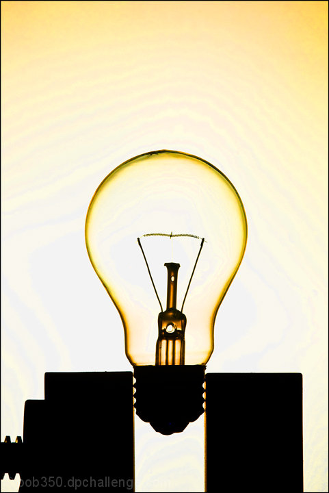
Congrats on the 6 and the new PB! The part of this that really makes it for me is the threads meeting the blocks and the echo of the threads in the element in the lower left. Well thought out design! |
|
| Photographer found comment helpful. |
|
|
07/07/2008 11:23:21 AM |
|
In response to your interest in others' thoughts on this in the "personal best" thread, the thing that first strikes me here is the amount of space at the top of the frame. Next I'm struck by the cramped composition below. For me, it doesn't make for a well-balanced photograph. Stylistically, it's a very interesting picture, and I think you've done well highlighting the form of your subject and contrasting its attractive transparency with the blocky, firm solidity of the clamp. That's nicely presented. Overall though, the composition is in my opinion what prevents this photograph from being a 6.5 or higher. I also think your post-processing (which I believe is what's responsible for the "banding" in the negative space area at top) is somewhat overdone, though it could be said that it enhances the yellow already in this to present what seems to be an illuminated yet dark bulb. Anyway, overall nicely done, and congratulations on your personal best. |
|
| Photographer found comment helpful. |
Comments Made During the Challenge  |
|
|
07/05/2008 02:25:48 PM |
|
Clean and simple. I like the composition (is that a vice?). |
|
| Photographer found comment helpful. |
|
|
07/03/2008 11:56:12 PM |
|
Very good idea! Great photo! |
|
| Photographer found comment helpful. |
|
|
07/02/2008 08:23:21 PM |
|
Original idea. Nicely done, very illuminating shot! 8 |
|
| Photographer found comment helpful. |
Home -
Challenges -
Community -
League -
Photos -
Cameras -
Lenses -
Learn -
Help -
Terms of Use -
Privacy -
Top ^
DPChallenge, and website content and design, Copyright © 2001-2026 Challenging Technologies, LLC.
All digital photo copyrights belong to the photographers and may not be used without permission.
Current Server Time: 06/29/2026 01:55:45 PM EDT.