| Author | Thread |
|
|
05/26/2008 10:26:40 PM |
|
This is SO powerful! Wow! |
|
 Photographer found comment helpful. Photographer found comment helpful. |
|
|
05/26/2008 09:36:32 AM |
|
| Photographer found comment helpful. |
|
|
05/25/2008 07:37:34 PM |
|
BRILLIANT .. another amazing photograph .. love your processing .. the green brickwork and his face so contrasty with his colouring .. this is very excellent . !!..:) |
|
| Photographer found comment helpful. |
|
|
05/25/2008 05:24:06 PM |
|
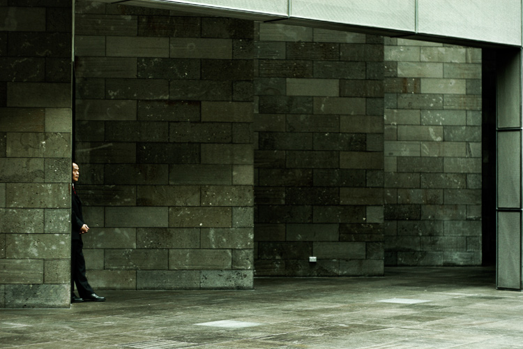
I took me a moment to find the human. I like that. Use of space is interesting. The green tint is mysterious. |
|
| Photographer found comment helpful. |
|
|
05/25/2008 11:43:48 AM |
Very cool. Very zen.
I didn't notice the windows on the right until I read the comments. Count me in the group that they don't bother... 8)
If I were going to work on the shot, which I'm not, I might try and get rid of that sliver of light area above the guy's head, but again, it doesn't bother me that much.
Excellent shot. |
|
| Photographer found comment helpful. |
|
|
05/25/2008 11:17:49 AM |
|
Great comp. Love your use of neg. space. Linear and cool. |
|
| Photographer found comment helpful. |
|
|
05/25/2008 10:33:21 AM |
Oh Liiiiisa!! This is so awesome! I LOVE this one!! LOVE IT!
|
|
| Photographer found comment helpful. |
|
|
05/25/2008 10:01:07 AM |
|
| Photographer found comment helpful. |
|
|
05/25/2008 10:00:08 AM |
|
Oh, there are so many thing he could be doing. Of the one's I can mention, I'm guessing he's taking a moment to gather himself for an important meeting. And I disagree with both of the previous comments. I think the column on the right does belong because of the similar piece across the top. It finishes the frame. JMHO. |
|
| Photographer found comment helpful. |
|
|
05/25/2008 08:28:18 AM |
Hey this looks like a  nixter style of image, and I love it..... nixter style of image, and I love it.....
I also agree with Ken, to crop the section on the right, as it doesn't really belong..... |
|
| Photographer found comment helpful. |
|
|
05/25/2008 07:56:13 AM |
I don't trust that dude. :)
Cool shot - I'd crop that column of windows out on the right - it just seems like it doesn't belong. |
|
| Photographer found comment helpful. |
Home -
Challenges -
Community -
League -
Photos -
Cameras -
Lenses -
Learn -
Help -
Terms of Use -
Privacy -
Top ^
DPChallenge, and website content and design, Copyright © 2001-2026 Challenging Technologies, LLC.
All digital photo copyrights belong to the photographers and may not be used without permission.
Current Server Time: 07/18/2026 12:02:11 AM EDT.