Several of you asked how it was done. It was so simple, I almost hate to post it and would rather leave ya'll thinking I was some kind of creative sort.
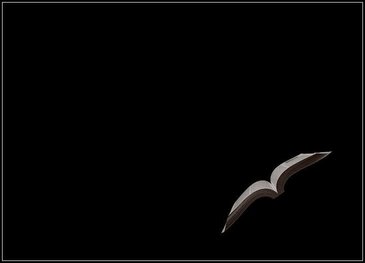
It is from the same shoot as the other (obvious) book picture. It is uncropped and I rotated it left about 30 degrees. Since the background was black, and it was a touch underexposed, I extended the canvas on the left quite a bit and on top (thus making it illegal for any challenge) to add more negative space. And, that was it. :)
Yes, it looks like a bird. I think something like this would be great for educators or a library or whatever. My only suggestion would be to maybe brighten the book a tad.
I like how you put your SC hat on to remind us that you cannot extend the canvas like that!
I thought liiking at the thumb that it was a bird flying from far away. I am glad that I came in and took a closer look. Great lighting and positioning of the book, love the minimalistic feel to it.
Great for an ad campaign about reading, though if that were a possible use, I'd have the book be just a bit more in the frame (though I realize that doesn't quite keep with your theme.) And yes, really does look like a bird - that was my first thought when the picture opened.
From the thumbnail, I thought it was a bird. I thought we had the same idea for today, but this is so interesting. How'd you do that! The lighting is exquisite against that velvet black background.
wow ... this is amazing ..
amazing because of the way we can take flight when we read a book ..
from the place where we are to a place we've never been ..
BRILLIANT . :)





 Add photograph to your favorites
 Add photographer to your favorites

 Photographer found comment helpful.


