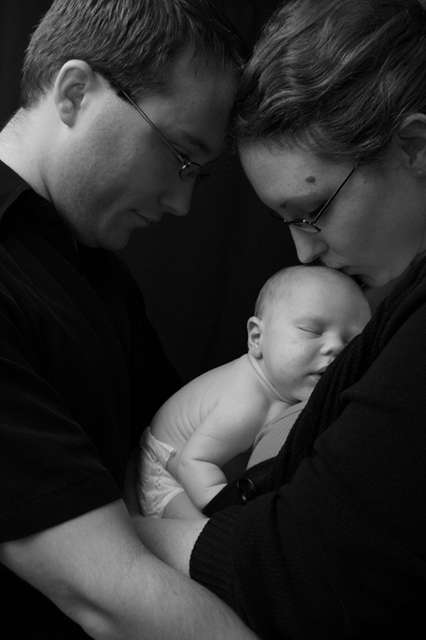
On the one hand I like how the baby is the most lit here (perfectly) drawing attention to the fact that he/she is the focus of their love. But, I then want to see the love and their faces are too dark to allow me to do that as well as I like. But, then again, it may be my monitor. *sigh*
If Iwere in charge of the wardrobe, I'd have put a long sleeved shirt on the man.
Good capture, do like the lighting, great expression on kiddo's face, wish we could see more of it, and maybe a slight distinction between his shirt and the background. Fits well with the theme.
Some things I personally would prefer... flattening the mother's shirt just a bit so I could see the infant's face just a bit more. And realizing that it's complicated, slightly better light on the parent's faces (not enough to detract from the infant, who is the center of this image, but enough that they are not in darkness). For example, the father's neck is too bright, while his face is too dark. Perhaps bringing the light around to the front just a little bit more would help? Or else block the light reaching his neck so it doesn't detract from his face...






 Add photograph to your favorites
 Add photographer to your favorites


