| Author | Thread |
|
|
04/01/2004 07:41:21 AM |
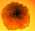
Hi Trinch
Re your request for comments on the above image.
First of all I gave this shot a 7.
It was one of the better images in this challenge.
I liked the lighting of the head of the flower and the variations of the 2 main colours. The angle of your shot was fine, however the background was a bit distracting (particularly the top 1/3rd which was different to the rest of the background which was mottled. A slight adjustment to the angle from which the shot was taken could have rectified this.
Hope that you find my comments useful.
cris |
|
 Photographer found comment helpful. Photographer found comment helpful. |
|
|
03/31/2004 10:45:43 PM |
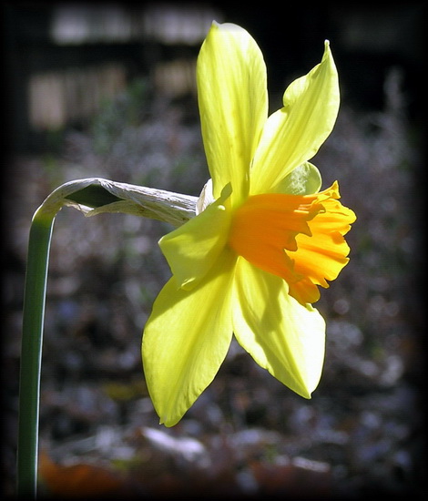
Per your request in the forums....
I love the shape of the daffodil. It is a common flower. I see them all over the place, but this doesn't diminish the actual beauty provide by its shape and dimensions. The brilliant color variations that are available among the various species of this flower are great subjects for photography. There is a lot of fine detail to work with on this flower.
Now.. you are wondering about the results based on the challenge...
Elements of great photographs include shape, perspective, textures, and color for starters. Your subject has strength in shape, texture, and color, so you definitely have a subject worthy of exploration with the camera. The perspective from which you choose to photograph it will also make or break the shot.
Perspective:
I think the perspective you chose is ok. I can't see anything blatantly wrong with it. What other perspectives did you explore? If I had approached this subject, I probably would have made 5-7 distinctly different shots based on perspective alone.
Color:
The yellow and green combination are complementary of each other. They just naturally work well together. The variation in yellow presents some nice eye candy on this subject as well.
Texture:
This blossom has some distinctly interesting texture that could be highlighted in various ways.
Shape:
I think that shape is the strongest element of this, especially when coupled with the color. The contrast that could be created here with these shapes against the background are quite powerful.
Problems:
Light and background... Your background does not support the subject at all. Even though it is outside the depth of focus, it is distracting and full of contrast that is somewhat irritating. The amount of light that is falling on your subject is a bit harsh. It creates some lost detail in some of the highlights and it also creates some shadowing that creates extra unnecessary contrast.
How to rectify these issues:
1. Different time of day or different weather conditions... the direct sun is your enemy in this image. You could also create a portble 'cloud' to diffuse the direct light or have someone stand in the way of the direct sun to put this bloom in the shade.
2. Eliminate the unpleasant background. You can achieve this by shooting at night using artificial light or a flash and finding the correct exposure to fully darken the background. You could also place a sheet of a variety of colors of posterboard behind the flower to eliminate the background.
Some people will balk at removing the natural background. However, in this particular photo, the natural background doesn't work for me. If you want to maintain the natural background, you should choose a flower in a different location with an acceptably supportive background to work with.
:) |
|
| Photographer found comment helpful. |
|
|
03/31/2004 08:58:20 PM |
I didn't get to commenting on all of my 4 scores as I'd hoped, but here goes.
The border takes away from the brightness of the flower. Great DOF, but the angle just seems a little...blah. Perhaps from more infront or below, but the above doesn't give us the full effect. There is more yellow than orange, and the orange is not the main subject of the photo. Really beautiful clarity, but the colors, angle, and border hurt it. |
|
| Photographer found comment helpful. |
|
|
03/31/2004 08:23:24 PM |
|
Personally, I really liked this shot. The DOF was excellents and lighting was quite nice. What killed you (I Think) is that you could have used a different angle to use a lot more of the frame. I just feel like there is a little too much empty space. Maybe that black border, especially the way it fades gives the photo kind of a constrained feeling, even with all that extra space (if that makes sense). This are just a few things that I noticed. I really think it should have done a little better than it did. |
|
| Photographer found comment helpful. |
Comments Made During the Challenge  |
|
|
03/30/2004 10:16:37 AM |
|
Nice lighting and DOF.... |
|
| Photographer found comment helpful. |
|
|
03/25/2004 06:25:34 PM |
|
| Photographer found comment helpful. |
|
|
03/24/2004 06:01:08 PM |
|
Pretty, clear shot. I would have liked the angle a little bit more straight on. |
|
| Photographer found comment helpful. |
|
|
03/24/2004 07:21:33 AM |
|
Lovely colours and use of light |
|
| Photographer found comment helpful. |
Home -
Challenges -
Community -
League -
Photos -
Cameras -
Lenses -
Learn -
Help -
Terms of Use -
Privacy -
Top ^
DPChallenge, and website content and design, Copyright © 2001-2026 Challenging Technologies, LLC.
All digital photo copyrights belong to the photographers and may not be used without permission.
Current Server Time: 06/28/2026 07:27:37 PM EDT.