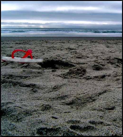
This is a well done composition. You have enough space for the title/side text, so it fits the magazine challenge. A lot of detail, nice saturation and it keeps the viewers eye busy going through detail.
The bottom of the picture could be more in focus/sharper, and you could maybe increased the brightness a bit, and increased the contrast. But overall a well thought through capture.
This is a very clever idea for a picture. I think it would be a bit better if the thong (or flip flop) were in better focus and the angle of the shot was higher so the thong wouldn't look so huge. At first I had a hard time figuring out what it was.
Very interesting composition, which invites the viewer to reflect on it for a while. Subtle and imaginative use of blue and red. Not sure what happened to your foreground texture though, it doesn't look good up close. Is this as a result of butchery by NeatImage? Maybe too much contrast? I would say that the overall mood, although very effective, is too drab and bleak for a tourism magazine.
I like the "grainy"-ness, no pun intended, but a little bit more shallower of a DOF (maybe just the immediate foreground before the sandal) would have been effective.




 Add photograph to your favorites
 Add photographer to your favorites

 Photographer found comment helpful.


