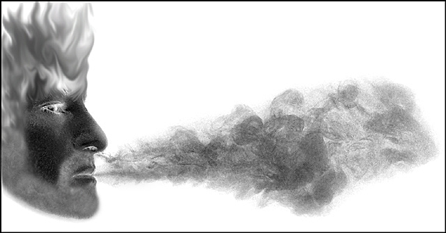
Interesting. The profile and smoke are very graphic and are enhanced by the crop. The added flames on the head take away from the impact. Good choice of using the negative filter. Did you try cropping down to just above and behind his eye? I like it a lot but feel it was mistreated during the post processing stage.
Good concept and plenty of room for type, although the exaggerated horizontal layout should test voters' perception of a magazine cover. The effects are cool, but end up looking far more like an illustration than a photo.
This is the most creative picture I have ever seen taken from a camara and touched up. WOW! It looks like Zues the greek god blowing wind. Very very awesome, you have real talent to take a picture and make it a dream.
(I'm writing this to everyone who submitted a landscape shot) The challenge was to produce a shot worthy of a magazine cover but to me a shot like this is not suitable to be put on a "portrait" format magazine.
---ADDITIONAL---
Due to forum discussions and accusations that marking landscapes down is nitpicking, I'm going through them and remarking. I still think some of the landscapes would not make good covers because of their orientation but I am no longer marking down because of that.
I still think landscape is inapropriate for the majority of magazines but I'll give the benefit of the doubt to the photographers.





 Add photograph to your favorites
 Add photographer to your favorites


