| Author | Thread |
|
|
10/07/2002 02:49:00 PM |
|
Can't believe this placed so low - I gave it a 9 and it was one of my favourites for the week (but had frantic week so didn't have a chance to comment on any images). I seem to like it for all the reasons the voting comments disliked it... |
|
|
|
10/07/2002 10:22:00 AM |
|
I liked this a lot for exactly the reasons you described. I gave it 9. |
|
|
|
10/07/2002 08:56:00 AM |
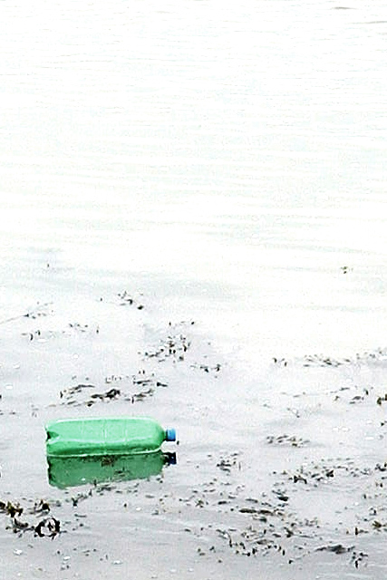
Remie, I liked your photo a lot and gave it an 8. I love the overexposure and the green bottle is a nice colourful spot which makes the photo interesting. I also like the grain because it adds to the more "unrealistic" look of the photo, almost like a painting like you said.
The other photos of the same style I found on your website (//home.wanadoo.nl/~rwam/portfolio.html) are also very good, especially the one called "Linear reflection". Simple but effective. I guess you had a hard time choosing your submission out of these. ;-) |
|
Comments Made During the Challenge  |
|
|
10/06/2002 06:12:00 PM |
|
over exposed and over compressed ... although, this shot should have been in the negative space challenge |
|
|
|
10/06/2002 01:44:00 AM |
|
I think the whole picture is a little too washed out for my liking, though it really does bring the viewers focus to the green bottle. |
|
|
|
10/05/2002 09:53:00 PM |
|
This one might be good for the current challenge-as well. |
|
|
|
10/05/2002 01:17:00 AM |
|
I'm fairly new to photography but this seems too light and faded out to me, however I like the way it makes green in the bottle stand out. |
|
|
|
10/04/2002 10:45:00 PM |
|
The title could have been: "The Boat of My Dreams" or "Reflections on Consumer's Economy" |
|
|
|
10/04/2002 10:22:00 AM |
Nice idea, a little too white in the highlights for me.
Kavey |
|
|
|
10/03/2002 01:30:00 AM |
|
|
|
10/02/2002 07:59:00 PM |
|
|
|
10/02/2002 04:36:00 PM |
|
this would've done well for the negetive space challenge a couple weeks back too. |
|
|
|
10/01/2002 09:38:00 PM |
|
this might be good for the garbage challenge. Although too grainy imo. |
|
|
|
10/01/2002 04:57:00 PM |
|
The green bottle against the starkness of the white is very appealing. Excellent composition. This picture seems to have a story to tell! |
|
|
|
10/01/2002 02:47:00 PM |
|
The image quailty is not so good, but the idea here is excellent... the composition is also very nice... great shot :) - setzler |
|
|
|
10/01/2002 11:08:00 AM |
|
The photo is a little too bright which is distracting. I like the fact that the green is the only color present, though. |
|
|
|
09/30/2002 05:51:00 PM |
|
|
|
09/30/2002 12:03:00 PM |
|
Hum, I think this shot is way too bright, a little burned out from the glare. It's happens. Clouds can be your friend. Score 6 Justine |
|
|
|
09/30/2002 11:49:00 AM |
|
Meets challenge. I'm sure you had to lighten this a lot to be overexposed to show the reflection. Good use of Neg space. Good luck in the challenge. Grayce aka Gracious |
|
|
|
09/30/2002 08:54:00 AM |
|
This could have been REALLY good if it was very over-exposed Good composition on the part of the photographer, though. |
|
|
|
09/30/2002 12:40:00 AM |
|
I think this would have made a nice negative space entry. It's not.... exciting to me. You definitely met the challenge. What's at the top of the photo - water, more sand - it just seems a bit overexposed up there... - JB |
|
Home -
Challenges -
Community -
League -
Photos -
Cameras -
Lenses -
Learn -
Help -
Terms of Use -
Privacy -
Top ^
DPChallenge, and website content and design, Copyright © 2001-2026 Challenging Technologies, LLC.
All digital photo copyrights belong to the photographers and may not be used without permission.
Current Server Time: 06/28/2026 08:44:57 AM EDT.