Trust me, this is the way to start at dpchallenge. You've already achieved "the brown" which I've yet to do, despite several serious attempts (serious, but not intentional...). Welcome to dpchallenge - hope to see a lot more of your work. There are lots of opportunities here to learn and improve. Try visiting the forums (Community) and participate in some side challenges, read the tutorials, etc. Lots here. We're glad you're here.
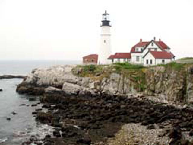
This photo feels like it was cropped to small and then just enlarged to get it bigger. You might have been able to crop the original image down to 640pix so that it wouldn't have pixelated so badly. Just a suggestion, I like the lighthouse though. -BB
This is definately a landscape more than architecture imho. Could have benefited from waiting until a different time of day, to capture some different contrast between the actual lighthouse tower and the sky. Some other angles than the standard picture of a lighthouse would probably ad some points as well.
Did you have some problems with the resizing? Looks like this photo looked great in the original, maybe the main lighthouse filling the frame would have been more effective for the challenge? I think Black & White conversion would have been really great!
This is a pretty good composition of an interesting scene, but the horrible compression artifacts really detract! If you are a new member and need advice on uploading future entries, drop me a PM.
This is very well composed, but not sharply focused enough to be a winner, in my opinion. The blues could be upped a bit, also, to make it more appealing.
This picture looks like it was enlarged from something half the size (heavily pixelated), out of focus, plus the Light is washed out against the blown sky. Portland Head Light is otherwise very photogenic...
Looks like Maine...? There are some serious, serious quality issues here, I'm afraid. The composition has a lot of potential, but the focus and jpg compression just absolutely murdered this.






 Add photograph to your favorites
 Add photographer to your favorites


