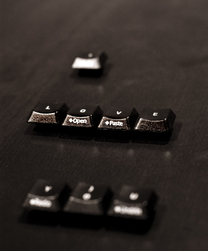
good control of DOF in this one - i like this version much better than the first week's entry. I just wonder if the crop could come in a bit on the top - a lot of dead space above the "I"
I said "cute" on the first one you did, and I kind of regret that now. I think these are more substantial than that, and I apologize for not seeing it right away. I really like both of these - you did a great & creative job!
I like them both. Ok. . .I have a vision. 5x7 prints. . with huge white mats in a simple black frame. Both of them side by side in kind of a contemporary setting -- orrrrrr -- maybe as decoration for your office or computer area.
If you're asking if I like this one better, I would say yes. Reason being the isolation achieved via DOF. It seems a richer image for the selective focus.
I like it but I do have to say that I like the other better. I like seeing the whole message clearly. The lighting is also a bit bright on the words open and paste on the "love" keys.




 Add photograph to your favorites
 Add photographer to your favorites


 Photographer found comment helpful.


