| Author | Thread |
|
|
03/01/2008 08:58:05 AM |
|
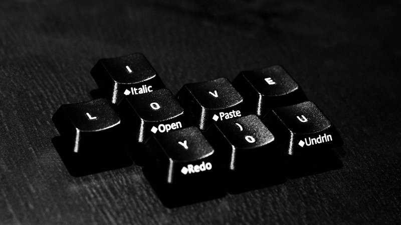
I like this, from conception through to finish. I like the little details in the front lettering on the keys (like that the "u", the last letter, has "Undrlne" on it as if to emphasize the point) to the processing. |
|
 Photographer found comment helpful. Photographer found comment helpful. |
|
|
02/07/2008 01:25:15 PM |
|
I like the low key aspect of this on the dark background...it really makes the letters pop. I agree about the DOF as well... |
|
| Photographer found comment helpful. |
|
|
02/04/2008 05:23:53 AM |
|
Made me smile :) The lighting brings out the surface texture on the keys and gives depth to the image. |
|
| Photographer found comment helpful. |
|
|
02/03/2008 11:47:47 PM |
|
Nice and gritty. Agree with others about DOF, also would like the L better aligned; but overall delivery suits original concept. |
|
| Photographer found comment helpful. |
|
|
02/02/2008 03:24:41 AM |
|
Cool idea! I agree with comments already made with regards to DoF and a lighter background. |
|
| Photographer found comment helpful. |
|
|
02/01/2008 01:37:16 AM |
|
Really cool idea. I do feel that the DOf could be a bit larger so allthe letter could be in focus. I also think the keys themselves get lost in the background. Maybe a highkey on white background would get tehm to pop. |
|
| Photographer found comment helpful. |
|
|
01/31/2008 11:31:59 AM |
|
That is some nice contrast. What a creative idea and well executed. |
|
| Photographer found comment helpful. |
|
|
01/30/2008 05:36:24 PM |
|
Creative. Cool idea. I like the slanted angle you chose. But I agree with some of the others that a lighter background and little more depth of field would help. |
|
| Photographer found comment helpful. |
|
|
01/30/2008 12:25:03 AM |
|
Cool idea! I agree a lighter background may help out and a focused 'Redo' would be nice. Perfect example of when to use your DoF preview - if your camera has one. Love the idea though, this would look great if the keys were a Valentine's Red! |
|
| Photographer found comment helpful. |
|
|
01/29/2008 06:50:12 PM |
|
Interesting photo, the background takes away from it, maybe completely dark with just the keys lit...I think that would accentuate the message as well. |
|
| Photographer found comment helpful. |
|
|
01/29/2008 06:13:18 AM |
|
you gave this a good treatment into black and white. It has good strong whites and blacks. A simple message delivered effectively. |
|
| Photographer found comment helpful. |
|
|
01/28/2008 03:16:42 PM |
|
This is certainly a remarkable photo, but for me it's a little bit overdone. Think it would be better if everything was in focus. Your outtake looks a lot more "friendly". |
|
| Photographer found comment helpful. |
|
|
01/28/2008 12:33:26 PM |
|
Sparse, limited, austere, are tools that I could learn to use from you. Patterns too. |
|
| Photographer found comment helpful. |
|
|
01/28/2008 12:30:58 PM |
|
| Photographer found comment helpful. |
|
|
01/27/2008 01:33:59 PM |
Love the idea though not overly keen on the processing nor background choice (maybe a lighter wood would work better so you could keep the grain?). Using the zero instead of O in love was a great idea and you have a much more informative keyboard then me ;)
Am guessing you didn't use a tripod looking at the exif? |
|
| Photographer found comment helpful. |
|
|
01/27/2008 12:29:23 PM |
|
This is fun - is there a story behind this? :) Great black and white contrasts - especially against the dark textured flattop. Since there is a message here, my preference would be to see the "y" key in focus as well. Cute photo. |
|
| Photographer found comment helpful. |
|
|
01/27/2008 10:19:42 AM |
You have certainly made the whites to "dance" in the darkish rendering of "Ye Old Typewriter Keys..." To that aspect, it is an excellent photo. Now, as to personal preference, I would have liked to seen the word, Redo, a little sharper, and the over-all a bit lighter. (However, I do confess that lightening this could have had the adverse effect of increasing the high-grain content.)
Two possibilities: Even at this F-stop, I think the over-all would be acceptably focused, if you set the auto-focus on the word, Redo.
Secondly, when I see high-grain photos, the cog-wheels of mind start to buzz wondering, "If this were my photo, how could I minimize the grain?" (So much of my commentary is merely "out-loud processing" that you can easily "take or leave." When I comment on photos, I am always trying to grow as a photographer. If I actually say something that helps you or somebody else, then I...am...thrilled!) As to the actual suggestion, I guess that I would try to highlight the keys using Magic Wand, Polygonal Lasso, or even Magnetic Lasso, and then select inverse to highlight the background. Once highlighted, I would "play around" with Guassian Blur or even Blur Tool, if I didn't want the blur to be too even over-all.
Bottom Line: You obviously have the "eye" of a photographer! Never allow your patience to "wear thin" in the intensely technical world of digital photography! Much success to you! :) |
|
| Photographer found comment helpful. |
|
|
01/27/2008 03:31:35 AM |
|
Nice image and nicely composed - there is the potential of making it a stronger image with a lighter background to contrast with the dark keys. I do really like the creativity. |
|
| Photographer found comment helpful. |
|
|
01/27/2008 01:59:24 AM |
|
Nice job on the high contrast, and a wonderful message. |
|
| Photographer found comment helpful. |
|
|
01/27/2008 01:03:53 AM |
|
A very nice sentiment! Prime lenses can be fun, yes? I see the words before I see the letters, which I think is kinda cool. |
|
| Photographer found comment helpful. |
|
|
01/26/2008 10:15:33 PM |
|
Imaginative, and well composed. |
|
| Photographer found comment helpful. |
|
|
01/26/2008 10:06:56 PM |
|
ahhh, shucks...nice high contrast work - i especially like the extra words on the keys to provide an extra set of messages - is this love open? or is is a redo? |
|
| Photographer found comment helpful. |
|
|
01/26/2008 09:18:45 PM |
|
This is great fun, and perfect for this time of year. |
|
| Photographer found comment helpful. |
|
|
01/26/2008 05:49:25 PM |
|
I agree "cute". I wonder about a white board instead of dark. The texture on the surface of the board seems distracting to me. I like the light on the key cluster. |
|
| Photographer found comment helpful. |
|
|
01/26/2008 05:40:43 PM |
Hey Chris! Welcome! I like your style. It's kind of "the simple" turned grungy and high contrast. For a nice artsy look :)
|
|
| Photographer found comment helpful. |
|
|
01/26/2008 05:09:54 PM |
Very cute idea! I think I'd like to see the "redo" key in a little sharper focus, but it's a cute image.
|
|
| Photographer found comment helpful. |
Home -
Challenges -
Community -
League -
Photos -
Cameras -
Lenses -
Learn -
Help -
Terms of Use -
Privacy -
Top ^
DPChallenge, and website content and design, Copyright © 2001-2026 Challenging Technologies, LLC.
All digital photo copyrights belong to the photographers and may not be used without permission.
Current Server Time: 07/05/2026 05:53:48 PM EDT.