| Author | Thread |
Comments Made During the Challenge  |
|
|
01/22/2008 04:26:15 PM |
|
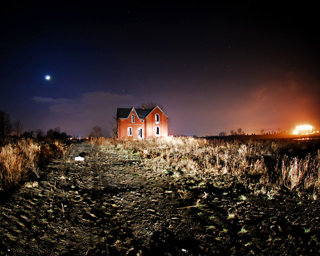
Interesting take, but I wish the house wasn't so close to dead center. Cropping some off the right/bottom (to put the house in the rule of 3rds position, and get rid of the orange glow) would have made it more appealing to me. |
|
 Photographer found comment helpful. Photographer found comment helpful. |
|
|
01/22/2008 02:19:25 PM |
|
Moon and sky are cool, I can't make out the orange light on the right. If i was to use headlights for lighting I think i would have got closer and put my shadow on the house maybe to look ominous, or got between the lights of the car , lean on the hood. |
|
| Photographer found comment helpful. |
|
|
01/21/2008 07:41:05 PM |
|
| Photographer found comment helpful. |
|
|
01/20/2008 06:45:15 PM |
|
The lighting on the house and on the ground around the house adds interest, it almost looks like car lights shining on the house. I thinks leaving the bright lights in the shot on the rigth are a bit distracting though, not sure how it would look with them cropped out. Overall I like it, it kinda has an spooky horror house look to it. |
|
| Photographer found comment helpful. |
|
|
01/19/2008 10:58:26 AM |
|
a crop to the right to eliminate the lights would strengthen this image. A little too much use of car headlights to light up structure but probably only way to go without trespassing. 7 for effort. |
|
| Photographer found comment helpful. |
|
|
01/18/2008 02:55:12 PM |
|
Wow! O.O’ Great job! Is that a fire off on the right? I love the contrast you created by having the moon on the left and a bright light (sort of like the sun) on the left. The reds and the blues...wow! :] The stars add a cool touch and the house looks amazing! Exceptional picture! Maybe next time try to not add so much distracting ground in front of the house. |
|
| Photographer found comment helpful. |
|
|
01/18/2008 12:37:29 PM |
|
Did you use headlights as lighting? It is very harsh with the shadows. |
|
|
|
01/18/2008 11:21:27 AM |
|
The lighting seems a bit harshn on the ground. Shame its basic editing, you could have darkened the ground. Nonetheless kudos for the idea |
|
| Photographer found comment helpful. |
|
|
01/18/2008 09:06:42 AM |
|
I think this would have been alot better if the house wasn't in the center (rule of thirds) and if you would have closed the apature a bit more to get a sharper focus and less DOF. |
|
| Photographer found comment helpful. |
|
|
01/18/2008 02:00:46 AM |
|
car lights used for lighting? shot couild have been taken better with a longer exposure and a tripod |
|
|
|
01/17/2008 02:21:37 PM |
|
Terrific potential with this shot, but I'm not sure it's capitalised on it totally. The central composition is a bit disinteresting and the overall feel a bit soft. Love the idea of the lighting though. |
|
| Photographer found comment helpful. |
|
|
01/17/2008 07:07:50 AM |
|
Interesting effect. How did you light that? Well done. |
|
| Photographer found comment helpful. |
|
|
01/17/2008 12:45:37 AM |
|
private property... but, doesn't look abandoned to me, kinda looks like a newer home |
|
|
|
01/16/2008 10:26:19 PM |
|
Beautiful. Love the moon, and is that a fire in the background? |
|
| Photographer found comment helpful. |
|
|
01/16/2008 09:58:29 PM |
|
Did you light this with your car's headlights? |
|
|
|
01/16/2008 08:52:47 PM |
Ravenshoe and Warden ... I shot the same house. I shot it from the other side also at nite.
What a classic ruin. It is my new favorite place. I actually tried the same lighting. I wish you could have cropped out the lites from the factory left. This is a good image otherwise. Good luck |
|
| Photographer found comment helpful. |
|
|
01/16/2008 09:58:12 AM |
|
I would have cropped out the bright light on the right. As it is here, it pulls the eye toward it and away from the building. |
|
| Photographer found comment helpful. |
|
|
01/16/2008 09:03:31 AM |
|
Is that your shadow in the foreground of the photo? |
|
| Photographer found comment helpful. |
Home -
Challenges -
Community -
League -
Photos -
Cameras -
Lenses -
Learn -
Help -
Terms of Use -
Privacy -
Top ^
DPChallenge, and website content and design, Copyright © 2001-2026 Challenging Technologies, LLC.
All digital photo copyrights belong to the photographers and may not be used without permission.
Current Server Time: 06/30/2026 12:47:18 PM EDT.