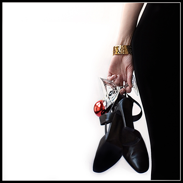
What a great idea. Love the use of negative space. Neat idea for an album cover with the text to the left. That hint of red and the shape of the bal is great. The gold of the bracelet too. NICE WORK.
It's a good photo, however there's something I don't like about it.. The shoes seem a bit soft, and the hand looks a bit too sharpened (that might be my blurry hangover vision though). The dress is nice though, and i like it that you can clearly see the curve of the body. Overall it's a pretty good photo.







 Add photograph to your favorites
 Add photographer to your favorites


 Photographer found comment helpful.


