| Author | Thread |
Comments Made During the Challenge  |
|
|
01/01/2008 08:40:43 AM |
|
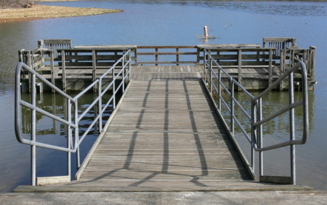
This would have worked better for me if the far end of the dock were in focus. |
|
|
|
12/30/2007 08:17:31 PM |
|
This gives me a sense of the setting, but I wonder if a more artistic image lurks inside waiting to be discovered. For an example of what I am imagining, consider sharpening a little, and maybe cropping the upper part just above that wooden railing near the water and the sides to just where the ramp begins to come up -- which would give emphasis to the shadows, planks, and water while taking away a number of elements that seem distracting to my eye. |
|
|
|
12/29/2007 10:04:16 PM |
|
I feel this shot suffers from being oof. |
|
|
|
12/29/2007 01:59:25 AM |
|
It all looks out of focus to me, other than maybe the top of the railing. I'd also say it's a shoehorn entry. |
|
|
|
12/28/2007 06:58:43 PM |
|
Blurry, not very interesting. |
|
|
|
12/28/2007 05:07:59 PM |
|
The subject is, well, dull. Also a bit out of focus. Sorry. |
|
|
|
12/26/2007 11:47:59 PM |
|
I have to say, nice title. The photo needs a little more to be more interesting, the focus is a little off. good idea, 5. |
|
|
|
12/26/2007 11:28:26 PM |
|
Too symetrical for my taste. A different angle may have been more interesting. |
|
|
|
12/26/2007 08:42:28 PM |
|
How does this tie into the challenge theme? |
|
|
|
12/26/2007 07:15:17 PM |
|
Nice photo with a great deal of potential, but this rendering of the scene is a little flat...IMHO...It needs more contrast & saturation, and it need a different crop (maybe a tight crop around one half the walkway down the middle. |
|
|
|
12/26/2007 03:41:18 AM |
|
Nice geometry. A bit soft and I think that a better contrast of light and dark and colour would have worked a bit better. It is all a bit mid-toned. |
|
Home -
Challenges -
Community -
League -
Photos -
Cameras -
Lenses -
Learn -
Help -
Terms of Use -
Privacy -
Top ^
DPChallenge, and website content and design, Copyright © 2001-2026 Challenging Technologies, LLC.
All digital photo copyrights belong to the photographers and may not be used without permission.
Current Server Time: 06/29/2026 07:39:48 AM EDT.