| Author | Thread |
Comments Made During the Challenge  |
|
|
01/01/2008 07:37:26 PM |
|
nice sense of depth, although it could use more contrast |
|
|
|
01/01/2008 06:07:16 PM |
|
great use of leading lines, but the section near the bottom is little distracting. |
|
|
|
01/01/2008 02:49:03 AM |
|
I think I would rather have seen this without the people in it, otherwise a wonderful shot! (8) |
|
|
|
12/31/2007 09:58:22 PM |
|
Pretty terrific, IMO the ledge/floor at the front should have been cropped. 7 |
|
|
|
12/31/2007 09:05:46 AM |
|
Goos use of thirds, nice draw to the end of the columns. |
|
|
|
12/30/2007 08:40:15 AM |
|
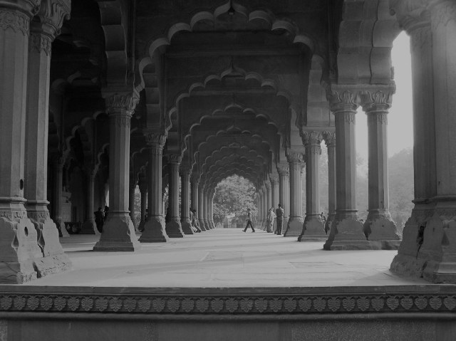
i think this is red fort agra. |
|
|
|
12/29/2007 11:59:41 PM |
|
The repeating pattern of scalloped arches and columns gives a nice visual rhythm to the image. It would be a safe bet that the people there mostly don't notice it because they fail to look up. Good eye to capture this one. |
|
|
|
12/29/2007 12:57:15 PM |
|
|
|
12/29/2007 12:17:13 AM |
|
powerful but soft in its holiness, good job |
|
|
|
12/28/2007 07:27:25 PM |
|
love the pattern!!! but it could use more contrast |
|
|
|
12/28/2007 08:28:53 AM |
|
The place is fabulous. A little bit too grey. |
|
|
|
12/28/2007 12:41:37 AM |
|
Great and nioe to see some life in it. |
|
|
|
12/28/2007 12:16:45 AM |
|
Neat looking. Certainly not the city that I live in! |
|
|
|
12/27/2007 06:05:27 PM |
|
What a well composed shot! A great spot and it fits the challenge well. My eyes would really appreciate more contrast in this image...darker darks and brighter lights. I'm curious how it looked in color. |
|
|
|
12/27/2007 05:07:19 AM |
|
Very nice Depth however while watching it i pushed by browser thinking it will show me some more on top, a lil more details on top will be nice, and the below frame can be cut down to another 5mm. Gr8 pic |
|
|
|
12/26/2007 10:09:06 PM |
|
Love this photo -- looks like something out of an old travel book. |
|
|
|
12/26/2007 09:10:14 PM |
|
What an amazing photo! I love the perspective that the person walking across the walkway gives it. The architecture is stunning. |
|
|
|
12/26/2007 08:53:13 PM |
|
This looks great on this monitor. On my other it looks a tad flat. Not sure why but my other is usually more accurate. Compositionally well done. The people in the distance are a nice touch. |
|
|
|
12/26/2007 08:25:35 PM |
|
This is interesting. It's almost all mid tones. I can't decide if I like that or not. I wonder what really playing with contrast would do. Hmm - I love the composition and perspective. |
|
|
|
12/26/2007 08:02:30 PM |
|
Pretty.... looks like a gorgeous setting |
|
|
|
12/26/2007 06:48:03 PM |
|
|
|
12/26/2007 09:36:45 AM |
|
Super shot, but monochrome conversion is crying out for more contrast IMO. |
|
|
|
12/26/2007 05:17:34 AM |
|
Love the subject but think a portrait orientated crop would have been better. |
|
Home -
Challenges -
Community -
League -
Photos -
Cameras -
Lenses -
Learn -
Help -
Terms of Use -
Privacy -
Top ^
DPChallenge, and website content and design, Copyright © 2001-2026 Challenging Technologies, LLC.
All digital photo copyrights belong to the photographers and may not be used without permission.
Current Server Time: 07/14/2026 06:54:53 PM EDT.