| Author | Thread |
Comments Made During the Challenge  |
|
|
03/09/2004 03:53:05 PM |
|
|
|
03/09/2004 04:58:52 AM |
|
I like compostion alot but i guess you ahot using camera flash, it just gives a flat look,7 |
|
 Photographer found comment helpful. Photographer found comment helpful. |
|
|
03/08/2004 04:46:51 PM |
|
Trite angle, background contrast is mundane. |
|
|
|
03/08/2004 10:23:00 AM |
|
A little bright, but nice idea. |
|
| Photographer found comment helpful. |
|
|
03/08/2004 01:46:55 AM |
|
Good object... but background and lightening? |
|
| Photographer found comment helpful. |
|
|
03/06/2004 12:12:49 PM |
|
good subject can improve perspective |
|
| Photographer found comment helpful. |
|
|
03/05/2004 11:33:27 AM |
|
|
|
03/04/2004 11:23:59 PM |
|
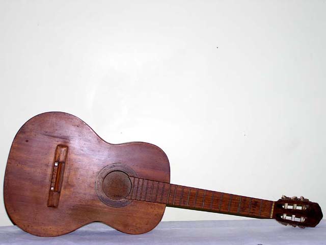
The light is a bit harsh on the guitar....but string that thing up and play! |
|
|
|
03/04/2004 01:20:46 PM |
|
looks like a flash was used, this could be a very dramatic photo but guitar is too far away to see detail, maybe shoot this with a lamp minus the lampshade as your only light source and shoot from an interesting perspective, like down the neck |
|
| Photographer found comment helpful. |
|
|
03/04/2004 11:03:38 AM |
|
but it makes for a nice sounding drum... the lighting on the body is a bit too harsh. |
|
| Photographer found comment helpful. |
|
|
03/04/2004 10:48:41 AM |
|
Highlight on guitar is distracting. |
|
|
|
03/04/2004 09:49:03 AM |
|
Gets the silence across! The photo itself needs some technical help. The flash glare on the guitar is distracting. The back line of the table or whatever the guitar is on is obviously slanted. The placement of the guitar and the amount of white space makes the photo lack interest. Standing the guitar up some, or using some other color in the photo might help. |
|
| Photographer found comment helpful. |
|
|
03/04/2004 03:31:41 AM |
|
| Photographer found comment helpful. |
|
|
03/03/2004 11:36:03 PM |
|
|
|
03/03/2004 10:09:10 PM |
|
This is a good idea but I believe it's poorly shot. You can see the reflection in the wood from the flash and it's almost too dark at the head. A different angle and position would have made this shot a lot better. |
|
| Photographer found comment helpful. |
|
|
03/03/2004 04:02:05 PM |
|
the white wal is boring/distracting |
|
|
|
03/03/2004 03:25:35 PM |
|
Ha ha. I like it. Lighting could have been better - there's a harsh glare of the face of the instrument. Also to composition is a bit bland as I fail to get a sense of this instrument as a crafted 3D object. |
|
| Photographer found comment helpful. |
|
|
03/03/2004 12:55:13 PM |
|
A bit too overexposed and the reflection on the guitar is annoying. Good idea, could just be set up better. |
|
| Photographer found comment helpful. |
|
|
03/03/2004 11:32:56 AM |
|
I absolutely love the idea of an unplayable instrument, but the composition is very weak. Shot with different lighting, a different background and angle would vastly improve this photo. 3. |
|
| Photographer found comment helpful. |
|
|
03/03/2004 09:15:52 AM |
|
Great interpretation of the challenge - photo could be stronger (e.g. flash on top of guitar, tilted horizon, backgound adds little) |
|
|
|
03/03/2004 07:06:41 AM |
love the idea, did you use the flash? I find the light to harsh
Harm |
|
Home -
Challenges -
Community -
League -
Photos -
Cameras -
Lenses -
Learn -
Help -
Terms of Use -
Privacy -
Top ^
DPChallenge, and website content and design, Copyright © 2001-2026 Challenging Technologies, LLC.
All digital photo copyrights belong to the photographers and may not be used without permission.
Current Server Time: 06/28/2026 10:05:27 PM EDT.