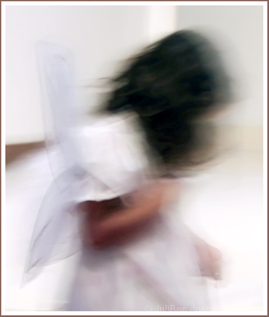
I'm not even sure I should leave this in the challenge. I know it will score badly. The shock of the motion blur sort of hurts my eyes when it first opens, but as I look at it and give in to the blur, I really like the quality of the image and what it represents to me.
There is an ethereal quality about it, and the bowed head implies a little reluctance and sadness on the part of this little angel. Hence the title "Too Soon".
In another version (not basic editing) I used a watercolor filter, and I think that takes away some of that initial desire to bring this into focus.
I hope you can get beyond the first two seconds and enjoy this wispy wee angel apparition.
-------------------------------------
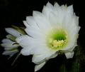
This is the watercolor version I mentioned above.
Statistics
Place: 57 out of 93 Avg (all users): 5.1021 Avg (commenters): 5.6000 Avg (participants): 4.6875 Avg (non-participants): 5.1675 Views since voting: 1266 Views during voting: 373 Votes: 235 Comments: 29 Favorites: 3 (view)
For what it's worth: I had this in my top 3 and I believe it deserves much better than this. It's just wonderful (and far better than the watercolor version imo).
Art. Nothing more complimentary I can say. I have to admit I might've missed the deeper story here had I voted this challenge, but with time to read your comments and really think, this has such a strong story that it's ... art.
I'm glad you left this shot in for the challenge... definitely steps outside the boundaries of the typical DPC winning shots! I tacked an extra point onto my vote for you since you had the guts to enter this, knowing it probably wouldn't score well (which made this one of my top 2 rated shots)! I'm glad to see that others took the time to look past the initial unexpected blur and liked it as much as I did, but still disappointed to see it place where it did.
I do like the other watercolor version that you did, but for me it goes a bit too far. I think I'd maybe prefer something that is in the middle of the two versions?
Thanks for sending me the PM. It can be a while before I check out my fave folder to see who entered what I faved. I do like this shot, and I so respect the guts to enter an image like this. I just found this to be a very pleasing image. Surely not in the DPC mold, but that makes it all the better. The watercolor version is no where near as nice as this one IMO. The only thing I would chang ein this shot is the brown border. Just isnt necessary. I expected this not to score well but the 5.1 is a bit harsh IMO. My 8 helped out a little bit though. Good luck in future challenges!
Julianne, your day will come, and suddenly you'll be getting high scores for these awesome images of yours. I love this photo - very ethereal and beautiful. The frame is perfect for this, too.
I also love the one with the watercolor filter - different and equally wonderful.
Ahhhhhh. . ..ya gotta love those non-artistic voters! I totally love this, and think the blur is perfect. I have been so tempted at times to submit photos using blur to make them awesome (for my tastes anyway). . .but in the end. . .I resisted realizing they just haven't caught on to the new beautiful artistic trend! And I'm sorry for that. . .because I think this is beautiful!
Ah - this was without a doubt my favourite image in the challenge - gave you my top score: grossly under-rated. You really deserved a top placing. Don't stop making pictures like this: maybe with persistence you can convert the way of thinking :-)
I think this is really beautiful! But I embrace the blur. Sad that some can't see it, but for those of us that can, I'm really glad you chose to leave this in the challenge.






 Add photograph to your favorites
 Add photographer to your favorites


 Photographer found comment helpful.


