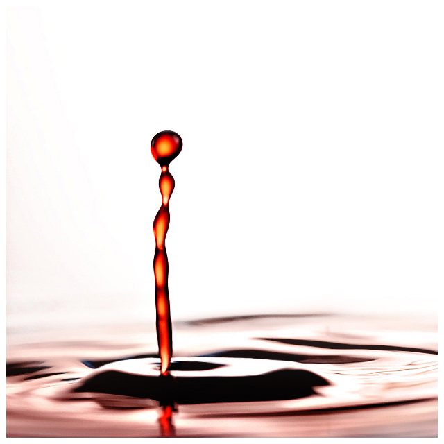
Not a duotoned but water with red coloring. This will probably get voting down for not being high on the creativity scale plus the forum chats of people being sick of these ;) but a lot of effort was put in with multiple test reshoots, something I don't normally do. More work was put into this than any other shot I did for the challenge. Trying to keep it different than other drop shots I've seen. I'm hoping to get at least 6.0. This was only cropped square because of the 640px resolution limit and I wanted as much detail to be visible. This was shot really close in and didn't even need a slight crop. Lit from behind and one regular light from each side. A lot of respect should go to the folks who go for those colissions with two or more drops. The patience , the reshoots... amazing really. Would've probably been easier for me if I had an ext flash though.
Went with this one because of its unique shape. Though these two outtakes might have been more in the spirit of stop motion:
Statistics
Place: 48 out of 138 Avg (all users): 5.9576 Avg (commenters): 6.6000 Avg (participants): 5.6923 Avg (non-participants): 6.0796 Views since voting: 1215 Views during voting: 358 Votes: 165 Comments: 13 Favorites: 0
Hi Techo,
Nice effort, The time an effort it takes captureing these images is remarkable. For those that complain about them try doing it first and find out what a major pain in the ass they really are :). As for this image I like the compostion, the placement is nice and I like the feel of motion you get at the bottom of the image and the stop motion on your main subject, nicely done. However I do think there is to much dead space here and the lighting is to strong causeing a bit of over exposure and a lose of some detail on the bottom third of the image. Maybe bounceing the light would have helped tone down the brightness a bit. Your main subject here could have used a little sharpening also. The use of the border here really didn't help much either.
Of the many liquid drop shots in this challenge, this is one of the better ones. The singularity of the column and its color are in positive contrast to the base and the background. Nice job.





 Add photograph to your favorites
 Add photographer to your favorites


 Photographer found comment helpful.


