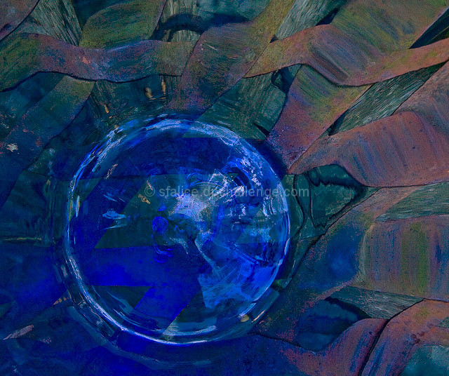
Pointed the 10-22 inside a large blue vase that I put on a latticework wrought iron table. Wow, the result was pretty much as you see. The base of the vase and the distorted table were exciting but very, very dark. While I lightened it up a bit, I hope it's not too dark for uncalibrated screens. Anyhow, I like it a lot.
Converted from RAW, cropped and flipped image horizontal, used levels and curves just a touch to lighten it up, used the shadows & highlights feature, and sharpen.
_________
October, 2007. that's when I began to diverge from what might be called the 'norm' and my scores began to plunge. To me, it was so 'obvious' that the base was below the top, that it had to be from the 'ground up.' Okay, enough of that!
For this side-challenge, it works and those rusty table colors mixing with the blue are exactly what I was (and am) looking for in my art and entries. A change fromthe norm.
Statistics
Place: 168 out of 214 Avg (all users): 5.0376 Avg (commenters): 6.0000 Avg (participants): 4.6327 Avg (non-participants): 5.2738 Views since voting: 1276 Views during voting: 370 Votes: 133 Comments: 12 Favorites: 0
mad as .. !!
love the intensity of the colours & the combinations of colours .. fantastic shapes ..
its a brilliant abstract .. would'v had no idea wot it was if you hadnt said .. ..:)
I really love those purplish-pink zig-zags around the center. Kind of reminds me of silk dress fabric. Great find. I don't think I would ever have figured out what it was unless you told me.
FWIW, great minds run in similar paths. Here's one I did awhile ago.





 Add photograph to your favorites
 Add photographer to your favorites

 Photographer found comment helpful.


