| Author | Thread |
|
|
02/16/2004 09:44:29 PM |
|
thnx for all the comments, i learn certain things which i do not aware of. |
|
Comments Made During the Challenge  |
|
|
02/08/2004 12:07:12 PM |
|
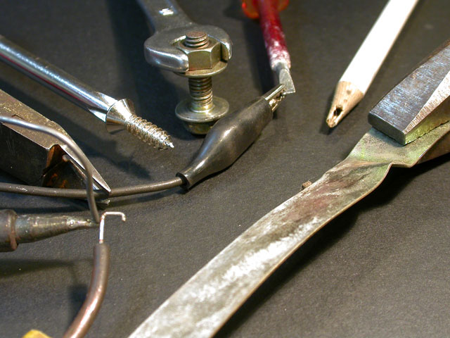
What is the purpose of the broken pencil? I like the concept of this photo. Its a good idea, but I think it could use some color, like some bright vibrant colors to really make it stand out. The lighting is a little bit flat too. As is it is pretty good but needs more visual impact I think to make it really pop off the screen at you. |
|
|
|
02/07/2004 11:43:47 AM |
|
Due to the vary dark shadows, it appears as though there is one primary light souce. This makes this image very contrasty (too contrasty) making the highlights burned out, and little detail in the darks. The pencil on the top is way too light.. .it grabs my eye for all the aattention then has nothing in it for detail to keep it there. It is an interesting concept to have all the tools interacting with eachtoher.. but perhaps a little busy. Maybe it would be interesting to have just one interaction.. oh hhh all except the pencil.. it isn't interacting at all. Good start. keep up the good work. |
|
|
|
02/07/2004 07:43:50 AM |
|
Technically, your picture is OK. The pencil is somewhat overexposed and your point of focus is the middle of the picture where there is no object so that all of the tools are just slightly out of focus. Also I am not sure what of the idea you are trying to get across as I don't see a relationship between all of the tools other than random tools placed on some black paper. I would have cropped out the lower portion of the picture to just below the shadow of the Pointed object on the left and that would have brought the viewer into the picture a little more. Good Idea but needs work:) |
|
|
|
02/06/2004 11:16:14 PM |
|
|
|
02/05/2004 07:37:41 AM |
|
Well shot, but the composition was a little busy. |
|
|
|
02/04/2004 04:43:36 PM |
|
the negative space in bottom right seems a bit too much here and throws the balance off a bit for me. |
|
|
|
02/04/2004 01:56:03 PM |
|
Interesting assortment, but the composition isn't interesting to me. I like the gray background. I would have brought the red tool more into play. Red and gray look good together. |
|
|
|
02/04/2004 12:02:13 PM |
|
Really like the concept. Lighting is good. Something about the composition (think it's the solder overlapping other element) on the right bothers me just a bit but I still like it. |
|
Home -
Challenges -
Community -
League -
Photos -
Cameras -
Lenses -
Learn -
Help -
Terms of Use -
Privacy -
Top ^
DPChallenge, and website content and design, Copyright © 2001-2026 Challenging Technologies, LLC.
All digital photo copyrights belong to the photographers and may not be used without permission.
Current Server Time: 06/27/2026 03:49:31 PM EDT.